III. BEIJING: CAPITAL OF CHINA, CAPITAL OF GRAFFITI
Adriana Iezzi
Beijing is a megalopolis where more than 21 million citizens live today: more than one third of the entire Italian population and almost as many inhabitants as the whole of Australia. This makes it the most populous country capital in the world! Today, 20 underground lines navigate the city, while up until 2007 there were only two. This speaks volumes about both its territorial extension and the rate at which the city evolves and transforms: a supersonic speed that we can hardly imagine. From an administrative point of view, Beijing lies at the centre of the Municipality of Beijing, an autonomous region covering a territory of about 16,400 km. The city is the political centre of mainland China, home to the National People’s Congress and all major Chinese institutions, where the most important decisions for the entire nation are taken.
It was founded under the Mongol Empire (the Yuan dynasty, 1271-1368) and named Dadu, or “The Great Capital”. In 1421 it became the capital of the Ming Empire (1368-1644) with its current name – Beijing 北京, or the “Capital of the North” – and has almost uninterruptedly retained this role ever since. Despite being the capital of the oldest empire in the world, Beijing, about 600 years old, is relatively young (Pisu 1976, pp. 15-16). Its founding is linked to a legend: the geometric perfection of its plan is the earthly translation of divine images that appeared in a dream to the Buddhist monk who was the tutor of the emperor Yong Le (1360-1424) who founded the capital during the Ming dynasty. One night he dreamt of a splendid otherworldly city – the residence of the Lord of Heaven – and suggested that the emperor draw inspiration from its pattern to build the new capital. Yong Le faithfully adhered to this divine vision in order to reaffirm the close relationship between Heaven and the emperor, called the Son of Heaven. Just as the Lord of Heaven lived within a Purple Enclosure, a constellation of celestial bodies clustered around the North Star, so on earth the Son of Heaven must live in a purple city protected by walls, representing the centre of the earthly world.
The Forbidden City was thus erected: an Imperial palace enclosed by purple-coloured walls – the centre of the city and the power core of the entire empire (ivi, p. 19). Up until forty years ago, all around this splendid residence with golden roofs (the colour of the emperor) was nothing but an endless expanse of one or two-storey houses with low curved roofs: in between geometric blocks, the tangle of dusty hutongs – Beijing’s traditional unpaved alleys – was a succession of grey blind walls (ivi, p. 29). Aside from the Forbidden City, only a few other temples and monuments scattered here and there would dot the sea of greyness: the Temple of Heaven, the Drum and Bell Tower, and little else. For Le Corbusier, the geometric perfection of the city layout and its plan made up of a set of straight lines intersecting at regular distances, represented the urban model of human perfection, as opposed to the city of Paris, entirely composed of irregular curves. According to the architect, it was indeed unthinkable that an “imperfect” city like Paris could claim to bring civilisation to a “perfect” city like Beijing (ivi, p. 19).
And yet, what remains of ancient Beijing today? Very little: it is a towering mass of ultra-modern skyscrapers in which the heights of the Forbidden City are lost and dispersed. All that is left of the hutongs and old neighbourhoods are fragments, since (almost) everything has been swept away by the fury of modern China’s bulldozers. The perfect tangle of orthogonal alleys has been overlapped by a series of motorway loops that expand well out of proportion and develop at the same unstoppable pace as the city. Still, the greyness remains, caused by the haze of pollution that constantly hovers over the city. This, however, is contrasted by the lively cultural scene that characterises the city. Beijing is one of the preeminent centres of culture in China, and in some respects the most important. It is home to the major governing bodies of the Chinese Academy of Sciences and the Academia Sinica (Pisu 1976, pp. 34-35), as well as no less than 91 university-level higher education institutes, including Peking University and Qinghua University, which are listed among the best in the country. Beijing is also home to the China Central Academy of Fine Arts (CAFA), China’s most prestigious art academy which has trained some of the greatest contemporary artists in the country (e.g. Xu Bing, Zhang Huan, Zhang Hongtu and Hong Hao), and to many other art and design academies attended by talented graffiti writers. In addition, Beijing has more than one hundred museums, including China’s most distinguished institution of modern and contemporary art, the National Museum of China (NAMOC), which has hosted the country’s most important exhibitions in the last forty years. Here, after being banned from exhibiting their ground-breaking works in 1979, the group of artists Stars (Xingxing) decided to display them on the museum gates, giving birth to Chinese dissident and avant-garde art. Ten years later, in 1989, the China/Avant-Garde Exhibition took place precisely at NAMOC. It was the first exhibition in the country dedicated to experimental art, with the aim of presenting the public with a complete overview of the works produced by the new Chinese artistic currents in the last decade. This step-up in exhibitions also concerned (and continues to concern) graffiti art. It was in fact at the CAFA Art Museum that China’s first international exhibition dedicated to graffiti and street art took place in 2016, entitled Art from the Streets (The History of Street Art – from New York to Beijing), with artists from the United States, Brazil, Great Britain, France, Italy, Portugal, Senegal, and, of course, China.
Beijing is thus confirmed as the heart of contemporary Chinese art development. In the last few decades, numerous galleries have opened their doors, joining the wave of eager interest in contemporary Chinese artists by international auction houses, collectors and museums from all over the world. In the second half of the 1990s, only a shrewd handful of galleries had realised their fruitful potential and created independent showcases for artists who previously had had very few opportunities to show their works to the world (Marescialli 2008, p. 23). In Beijing we find the country’s most important districts dedicated to contemporary art: Yuanmingyuan artists’ village, Songzhuang art community, 798 Art District and Caochangdi. These last two are particularly important for graffiti art. 798 Art District, located in the north-eastern part of the city, is an old state-owned industrial complex designed in Bauhaus style in the 1950s by a group of East German architects, which once housed a production line of electrical components for military use. In the early ’90s it was closed due to financial difficulties, but in 2000 it started to repopulate, attracting to its large (and cheap) spaces a growing number of local artists looking for places to set up their studio. Within a few years, it became “a sort of Chinese Greenwich Village” (Curcio 2015, p. 10), a “post-industrial-chic community made up of artists, designers, media people and white collars” (Marescialli 2008, p. 59), turning it into the first art district in the city. Today, the district houses contemporary art festivals, studios and dozens of independent artists’ homes, including painters, sculptors and photographers, several national and international galleries, museums, like the famous Ullens Centre for Contemporary Art (UCCA), art bookshops, designers’ studios, cafés, magazine newsrooms, and a number of local and international companies’ offices. It is also a central district for the spread of graffiti art in Beijing. Indeed, 798 is one of the areas where the first graffiti in the capital appeared: the studio of the Kwanyin Clan, one of the first and most important graffiti crews in Beijing, was based there, as well as China’s first graffiti store 400ML, opened in 2012 and run by the ABS crew. For the last 15 years at least, this is also the place where the city’s graffiti crews and writers have been meeting to create pieces on the buildings’ walls, and where various graffiti festivals are hosted. Among them, the most important is the annual Meeting Neighbourhood, which brings together artists and graffiti enthusiasts from all over the world.
The Caochangdi district, located about 20 km away from the city centre, is the second key art district in Beijing (after 798). Since Ai Weiwei (Beijing, 1957) chose to move his studio to Caochangdi in 1999, numerous other artists and galleries have followed, notably Chambers Fine Art, Ink Studio and Taikang Space. Unfortunately, since July 2018 the art district has been partially dismantled: many galleries and art studios, including Ai Weiwei’s, have been demolished or forced to relocate (Mouna 2018), leaving a large void in the artistic fervour developed in the area. The district is also a significant location for Beijing’s graffiti art, as it was home to the studio of the city’s and mainland China’s first graffiti writer, Zhang Dali1Zhang Dali worked in several studios: first in Yuanmingyuan in Beijing, then in Bologna, and then again in Beijing in Dongsi Shier Tiao 34 (during his graffiti period), Liulitun, Maizidian, Caochangdi – which was one of the most important, Heiqiao and now in Zhubaotun 1-3: http://www.zhangdaliart.com/en/studios.html (last accessed in February 2024)., and of Beijing’s first graffiti crew, Beijing Penzi, where its members painted skateboards and other similar items for commercial purposes (Feola 2014).
Beijing’s cultural and artistic turmoil, as well as its reputation as a postmodern hyper-commercial megalopolis pervaded by grey concrete and unbreathable air, made it the ideal setting for the development of graffiti art in China, also thanks to the spread of an underground culture that has flourished in the city since the 1990s. Today, the city seems to be the ideal setting for multicoloured and sometimes provocative graffiti that break its leaden monotony. It is no coincidence that the first manifestation of graffiti art in mainland China appeared precisely in Beijing.
The birth and spread of graffiti in Beijing
Graffiti art was introduced to Beijing by Zhang Dali, who embarked in 1995 on the artistic project Dialogue and Demolition (Duihua yu chai 对话 与 拆 , 1995-2005) (Fig. 2): he spray-painted more than 2,000 giant portraits of his head’s profile on the walls of buildings destined to be demolished, often accompanying them with the tags2Tag (qianming tuya 签 名 涂 鸦) – The pseudonym, stage name, or code name that every graffiti artist, mc and breaker uses to distinguish themselves, to stand out and highlight their presence in the city. Being the most basic form of graffiti, created with spray cans or markers, the tag is the backbone of the writing phenomenon. The evolution of the tag represents the personal style of its author. All pieces, even the largest, most colourful and elaborate ones, remain, in essence, signatures. The activity of marking a surface with a tag is called tagging-up, while tag bombing is the reproduction of one’s tag on a large scale in a certain area of the city. Tags can also be representative of entire groups. Different writers or mcs who join together can decide to use one comprehensive tag, as a symbol of the group (see Crew). AK-47 or 18k (abbreviations for Kalashnikov and 18-carat gold) (Wu 2000; Marinelli 2004). This artistic and photographic project, which triggered heated debate in Beijing in 1998, was intended to draw attention to the disturbing trend of demolishing entire districts of the old city with their history and the stories of the people who lived there. Its goal was to warn citizens about the side effects that modernization was bringing about in China (Curcio 2015, p. 71). The choice of its two tags (AK-47 and 18K) was by no means incidental: the abbreviation of the Kalashnikov recalled the idea of violence inflicted by the government on the city and its citizens; while the 18K gold was a reference to the power of money and the pursuit of wealth that was distorting Chinese society and culture. The idea of creating the first graffiti in the city was the result of the six years Zhang Dali spent in Bologna, where the artist moved after the tragic events in Tiananmen Square in 1989. In Bologna, the artist had taken part in the city’s intense artistic activity. Here he was introduced to graffiti writing for the first time, by which he was profoundly inspired. Once back in China, he realised the havoc that was being wrought there and decided to apply what he had learnt in Italy to the walls of Beijing. It may be said, therefore, that if graffiti art has managed to make its way into the Chinese capital, it is also partly due to Italian influences.
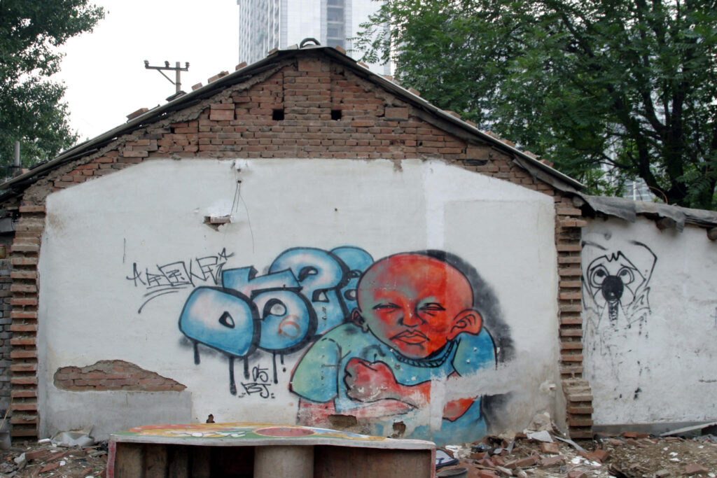
Although Zhang Dali is usually considered the “Godfather of Beijing graffiti” (Bonniger 2018, p. 21), some experts disagree. According to them, the first graffiti writer in the city was not Zhang Dali, who is regarded as a street artist rather than a writer, but Li Qiuqiu 李球球, known as 0528 (Fig. 3), who started his activity in 1996 (see Video section, film Crayon 2012; for Zeit see Mouna 2017). They argue that Zhang Dali’s work had no impact on the following generation of writers, since he always worked alone without interacting with other artists, and only practiced graffiti for a short period of his career (1995-2005), later moving on to other forms of expression – indeed, he identifies himself as an artist rather than a graffiti writer (film Crayon 2012; Valjakka 2016, p. 361). Li Qiuqiu’s work, instead, had a strong impact on the following generation: he has always interacted with young Beijing writers and, being a pioneer in this field, founded one of the city’s first and most important crews: the Beijing Penzi (Mouna 2017).
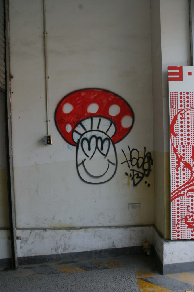
Regardless of the “rightful” authorship of the first Beijing graffiti, for about ten years Zhang Dali and Li Qiuqiu were unquestionably the only known writers working in the city (Valjakka 2016, p. 361). The next generation of graffiti writers appeared on the scene only in 2005, partly thanks to the establishment of The Great Wall of Beijing, he city’s first hall of fame3Hall of fame (tuya qiang 涂 鸦 墙) – A space where graffiti writing is (more or less) legal. Halls of fame are mainly popular with writers who aim to create artistic, sophisticated pieces, favouring quality over quantity and constantly searching for original styles. located on the southern side of Renmin University, a major university in the capital. The wall and its graffiti, or pseudo-graffiti, were all dedicated to the Beijing Olympic Games (Bonniger 2018, p. 22) to be held in August 2008: a momentous event for the entire country. The wall was 700 metres long and about 300 volunteers took part in its decoration (Llys 2015)4The wall was established on 11 December 2005. According to Llys, before the Asia-Pacific Economic Cooperation (APEC) summit in 2014, it was entirely painted in red, covering all works created since 2005.. The success of this large-scale project, supported by the government with evident propaganda purposes, increased curiosity and helped to spread interest in graffiti throughout the city, from public opinion and art circles to young art academy students. As a matter of fact, from 2006 onwards, individual graffiti writers started to gather, founding the first crews like the aforementioned Beijing Penzi and Kwanyin Clan. Besides, other street artists started writing individually, like Hades or The Little Mushroom (Xiao mogu 小 蘑 菇 ), who was very active in bombing5Bombing (zhajie 炸 街 / beng 崩) – Filling walls and trains with illegal graffiti, typically throw-ups, tags, stencils or simple lettering pieces that can be executed quickly. This is the favourite practice of writers whose primary aim is quality, and who cover the city with their tag to attain the fame of king. the 798 Art District, Sanlitun and the city centre. Most of his works consisted of a cartoon-like mushroom, usually depicted donning a red hat with white polka dots and a smiley face with various expressions on the stem. In keeping with the finest urban graffiti tradition, the artist’s identity is still unknown. We only know he is a designer, tattoo artist and skateboarder, which is quite common among Chinese graffiti writers.
Another important artist at that early stage of graffiti development was Xu Ruotao 徐若涛, who created graffiti in the district of Tongzhou in 2004. His writings were subsequently published in Art World, an important Chinese contemporary art magazine, marking an all-time achievement for this art form. Together with Li Qiuqiu, Xu Ruotao is a pioneer in the use of Chinese characters in his pieces: in one of his works created in 2004 near the Bali Qiao underground station on line 1 East, he wrote Mei ge ren dou shi shibaizhi 每个人都是失败者 (All men are fallible). Although the writing style is still very rudimentary, it is one of the first graffiti works entirely in Chinese characters in Beijing.
In those early years of graffiti development in Beijing, the favourite spots for graffiti writers were the 798 Art District, the Sanlitun shopping district, which is very popular among foreigners, the Wudaokou nightlife district, filled with bars and clubs, a few areas in the city centre, mostly those at risk of demolition, and the China-Japan Friendship Hospital (Beifu 北服), the oldest non-state-established graffiti hall of fame in the city (Crayon film 2012)6Llys affirms that the China-Japan Friendship Hospital became a graffiti wall in 2005. This is confirmed by an article about Su Bin 苏滨 in the art magazine Sculpture.. Ever since 2007, an increasing number of foreign graffiti writers has arrived in the city, introducing new styles and techniques and massively influencing the Beijing graffiti scene (Bonniger 2018, p. 23). Among those writers, we should mention Zyko (Germany) and Aigor (Europe), who “were showing them [the Chinese writer] the mental or internal side of graffiti” (Feola 2014). Zyko first came to Beijing in 2006, when there were few graffiti around, as he says, and then again in 2008, when the scene was much more active and had completely changed, mainly due to the intense activity of the Beijing Penzi crew. He thus decided to move to the Chinese capital in 2009 (film Crayon 2012). He mostly works alone, in search of his own style, but sometimes also collaborates with local and foreign writers (Valjakka 2016, p. 363). According to Zyko, one of the major problems of making graffiti in China is excessive costs: while spray cans are cheap, they are of extremely poor quality and last three times less than the European ones. He calculated that it costs around 20 euro to make one piece, which is a considerable amount for a Chinese person, meaning only those with adequate financial means can approach this form of art (film Crayon 2012). In terms of style, according to Zyko, the foreign writers who had the greatest impact on Beijing’s artists were the German Cantwo (a.k.a. CAN2) and the American Revok (from the MSK crew), also through their work in the city, as well as the AWR crew from Los Angeles (Valjakka 2016, p. 363).
In an interview, Aigor, active in Beijing for a couple of years mostly with his bombing activity, highlights another difference between China and Europe: although creating graffiti in China is dangerous, it is far easier than in Europe. Since this art form is still poorly known among the Chinese, there is little repression and much curiosity surrounding graffiti (film Crayon 2012). In Europe, writers can take two to five minutes at most to create a piece without being discovered, while in Beijing they can take even up to an hour. Zyko agrees with this view: he speaks of a form of “nice anarchist feeling in the street” that cannot be found in any European city. This form of freedom is the reason he does not want to leave Beijing (ibid.).
Other foreign writers present in Beijing in recent times are Mike (a.k.a. Iron Mike), from Stockholm, who has been active since 2011, the Italian Sbam, who arrived in 2012, and Zato, who came in 2013 and is still very active in the city today. What is special about Zato is that he frequently uses Chinese characters in his pieces: most of his works consist of bubble style7Bubble style (paopaozi fengge 泡泡字風格) – Rounded, old school style lettering, still extensively used in throw-ups due to its quick execution. The letters recall soap bubbles and are painted with great precision. The outline is usually thick, with a white inline to enhance the depth of the lettering. Phase 2 originally created this style. two-colour throw-ups8Throw-up (kuaisu tuya 快速涂鸦 / outu 呕吐) – The first evolution of the tag; a stylised drawing of one’s signature, quickly executed but on a large scale, with few colours that are usually sprayed roughly, even without fill-in. The throw-up is an art of its own: the style is immediate, often very simple and “rubbery”, yet never banal. It only consists of an outline with a monochrome fill-in, but the term can sometimes also indicate any kind of bubble style, thus not necessarily monochrome. This technique is scorned because it is deemed unesthetic, but achieving a good throw-up, quickly and with a precise outline, is no easy task. The throw-up is also known as a flop. Throw-ups can be from one or two letters to a whole word or a whole roll call of names. Often times throw-ups incorporate an exclamation mark after the word or letter., in which he transcribes the two Chinese characters Zatou 杂 投 , representing his Chinese tag, often accompanied by a caricature of a stylised man with cross-shaped eyes and a beak-like mouth. His ideal surfaces for writing are shutters, walls and roofs of shops and restaurants, while his favourite areas are those of the hutongs of the old city. Sometimes Zato also enjoys writing entire sentences or idiomatic expressions in Chinese characters with enigmatic meanings, such as Wo bu yao guoqu, wo bu yao weilai 我不要过去, 我不要未来 (I don’t want the past, I don’t want the present), Hen huang, hen baoli 很黄很暴力 (Very yellow, very violent), and Mei you yiyi 没有意义 (Without meaning), giving his works a mysterious aura (Feola 2013). The choice of employing Chinese characters in his pieces stems from his desire to make his art accessible to as many people as possible, and this, in his opinion, can only be achieved through the local language. According to Zato, graffiti has no special meaning and should have nothing to do with money, business, or art. Its only aim is to give passers-by the unexpected opportunity to come across new, striking sights (Huang 2016).
New generations: the KTS crew
Due to the international buzz surrounding the graffiti scene, new crews have been sprouting in Beijing since 2007, some long-lived and others with a very short lifespan. Among the latter, we should mention Jiu Men 九 门 (Nine Doors), which was founded in 2007 and disappeared the following year, and the Beijing xinshengdai tuyazhe 北京新生代涂鸦者 (Beijing Cenozoic Writers), formed by university students and active from 2007 to 2009 (Llys 2015). Other more successful crews, which are still active today, are ABS (founded in 2007), KTS (2009), DNA (2010), TMM (2011), Tuns (2013) and YDS (2016) (Bonniger 2018, p. 23).
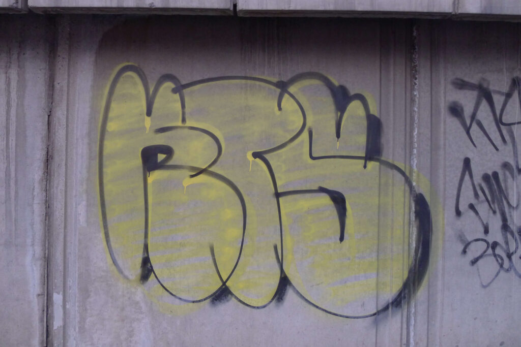
The KTS crew was founded by Mes and Boers, joined first by Wreck and later by Exas (a.k.a. Swe). This is one of the most respected crews in all of China (Crayon 2017). Its four members are old-school writers, and their activity mainly consists in bombing the city streets (Valjakka 2016, p. 362). Most of their work focuses on the crew’s acronym (KTS), which stands for Kill The Streets, later changed to Keep The Smile, or their names tagged-up in Latin letters, alongside bubble style or simple 3D style93D style (litizi fengge 立体字风格) – A three-dimensional style of letters, used to add effect on basic letters (enhancing depth and allure in the piece), sometimes applied to wildstyle for an extra level of complexity. In graffiti writing, the most widely used technique for 3D is chiaroscuro. To implement it, the artist first chooses the direction or vanishing point, then, starting from the edges of the letters, draws same-length guidelines following that same direction. Subsequently, the artist connects these guidelines, drawing lines that run parallel to the letter lines, and finally the area is filled with colour. The effect could be achieved by shadowing the letters, but this procedure is far more complex. This style was invented by Phase 2. blockbusters10Blockbuster or block – This is a kind of graffiti that is easy to execute. It is made of large, square or rectangular block letters. It is generally two-toned: one colour for the fill-in (using temper, roller or paintbrush) and one for the outline. Mainly invented to cover over other people and to paint whole trains easily, but they are effective on smaller walls for maximum coverage. Blade and Comet claim to have invented these. and throw-ups. Nonetheless, early in their careers (and beyond), Mes and Exas, in particular, produced numerous graffiti of their Chinese tags in Chinese characters – Fengji 疯 奇 (crazy, weird, funky) for Mes and Lingdan 灵 丹 (panacea, soul) for Exas – using different styles, from the more graphic (and calligraphic) to the more elaborate.
According to Mes, who is now 33, his first encounter with graffiti dates back to 2006, when he was still a high school student: after seeing graffiti on the Internet, he decided to pick up the spray can for the first time. From that moment onwards, graffiti became his purpose in life, and he never gave them up. At the beginning, his goal was to decorate the city by creating aesthetically appealing pieces, but he soon understood the sharp difference between “painting a wall” and “writing graffiti”, and started bombing difficult, dangerous places, creating his own distinctive style. About a year and a half after he started making graffiti he met Boers on Baidu Tieba, China’s most important online platform, and they started bombing together. At the time, Boers was a computer science student two or three years older than Mes, who used to paint cartoon style mice. During a graffiti competition in October 2009, Mes and Boers decided to found the KTS crew. Utterly engrossed in his new life, Mes quit high school during his third year so that he could spend every night bombing the streets of Beijing. Together with Boers, he set up a company through which he could use graffiti for commercial purposes, but the venture failed. Mes’ parents then started to put pressure on him and forced him to attend various design schools, until they decided to send him to university in Great Britain. Once back in China, again under pressure from his father, Mes started working in a design company, and has since been seen more and more sporadically painting graffiti along the streets of Beijing. A year younger than Mes, Wreck approached the graffiti world in 2008, thanks to the propaganda for the Beijing Olympics and the exponential rise of illegal graffiti in the city. He met Mes in 2009, once again through the platform Baidu Tieba, when KTS was the most important and active crew on the streets of Beijing. Wreck started an intense night-time bombing activity, together with the other two crew members, even venturing to write on trains, which is quite rare in China. The crew initially focused its efforts on the Haidian University District, one of Beijing’s key areas, home to the Summer Palace and the Old Summer Palace, where the three writers lived. Later on, they expanded their reach to the entire city. As stated by Wreck himself, the choice of his name is rooted in his desire to have his tag begin with a “W”, since no one had used that letter before, as well as in its meaning, evoking the concept of “ruin”, which comes close to the perception of what graffiti is for him: a thorny presence in an ordinary landscape (Huang 2016).
Because of his intense bombing activity, Wreck has been repeatedly arrested and released on bail, also with the help of his friend Boers. Today, he is a tattoo artist and owns a studio called Delight (Dengta 灯塔) located at 46 Fajia Hutong, an alley near Gulou East Street in the city centre, where he brings elements borrowed from graffiti art into his tattoos. His studio is also an important centre for the propagation of graffiti culture and a meeting point for Beijing writers, many of whom have become close friends of his. Although much less frequently than in the early years of KTS, until a few years ago Wreck could still be seen night-time bombing together with Giant (YDS crew), producing about one throw-up per month. Today, he is out of the scene. He has stated that he has not time to draw on the streets due to various family and work commitments, severe government restrictions, and the increased police monitoring of recent times. Exas was the last to join the crew but, after a very intense period of activity, he moved to New York to attend American schools. There he instantly saw the stark difference between doing graffiti in New York and in Beijing. As Exas says: “I couldn’t do anything too complicated or intricate because [in New York] I never had more than ten minutes to throw something up.” […] “In Beijing I didn’t care who was watching me because when I painted I felt like a god” (Crayon 2017).
Young crews, including women
The DNA crew revolves around the figure of its leader Daboo (Dabo 大波). Born in Beijing in 1989, Daboo started writing graffiti in 2005. Up until 2017, when he became a father, his main activity took place at night in the Daxing District, located in the southern part of the city. Here, he filled walls, bridges, and the rubble of demolished buildings with his tag, spray-painting simple to elaborate pieces (Yau 2018). In 2010, he founded the DNA crew together with other two writers. Their aim was to make graffiti for commercial purposes, decorating gyms, cafes, schools, and restaurants. As a result, most of DNA’s works are elaborate pieces with an “international” flavour, consisting predominantly of the use of English (the works in Chinese characters are rare) and western puppets11Puppet (tu’an 图 案) – Figurative elements alongside the graffiti. These may be human figures, animal-like monsters, or comic or cartoon characters (see Character)..
TMM (The Marginal Man, also known as The ManageMent) was founded at the beginning of 2011 by Clock and Dios, joined shortly afterwards by Gan, Camel and 525. Three members of the crew are not native of Beijing: one is from the Hubei province, one from the Hebei province and one from Canton (Valjakka 2016, pp. 362-363). The crew does not seem to be active anymore, although three of its writers, Clock, Camel and 525, continue to work individually. Clock mostly creates elaborate pieces, sometimes accompanied by puppets, and frequently works with the female writer Sick. To him, graffiti is a form of entertainment rather than rebellion against the system (see Video section, film Crayon 2012). 525, whose tag is based on his date of birth, prefers the activity of bombing, transcribing his tag also in large scale works. He often collaborates with Wreck of the KTS crew and is the author of some works in Chinese characters.
Camel (a.k.a. Camel617) is extremely good at painting cartoon style puppets with distinctly Chinese features: his characters are often portrayed eating or drinking local delicacies such as Peking duck or Chinese schnapps. These puppets are usually accompanied by balloons with Chinese writings in a very personal graphic style, a sort of title indicating the theme of the piece. He uses the same style in his spray-painted red square seals recalling those used in calligraphy or traditional paintings. Graffiti are a form of rebellion for Camel – although, like all Chinese writers, he knows that there are boundaries that should not be crossed, so he is careful not to paint his works in sensitive places such as Tiananmen Square or on government buildings and is always cautious about the subjects he portrays (Sebag Montefiore 2014). His 2009 work, spray-painted on a wall in Beijing, in which he portrayed an “urban inspector” (chengguan 城管) as an evil hooligan, gained him some fame and cost him a fine of 3,000 yuan (about 400 euro). In 2017, he created another important series of works with Chinese characters for the Internet technology company NetEase, with the goal of expressing the concerns of many young Chinese people. He painted five large-scale brightly coloured murals in three different Chinese cities (Beijing, Shanghai and Canton), in which he posed, in very personally styled Chinese characters, some critical questions for today’s youth (How can we avoid wasting our fleeting youth? What do we have that cannot be replaced by artificial intelligence? What is the best way to die?), together with some of the answers provided by those same youths (Fan 2017). Finally, Camel has created several stickers,12Sticker art (tiezhi 贴纸) – A form of tagging through computer-printed stickers that may contain only the writer’s signature and/or logo or be more elaborate, including small fonts and decorations. Sticker art is quick to execute, cheap, and easy to disseminate, and is considered a sub-category of graffiti art, although some writers believe that this type of art is only for those who are afraid of using markers or spray cans. something quite unusual among Chinese writers, in which he reproduces his style and puppets.
The Tuns crew (tunshi tuya tuandui 吞噬涂鸦团队), founded in 2013, is the first all-women crew in Beijing13This can be read on their official website, while their ZCool page states that the Tuns crew was founded in 2014 and consists of Zhao, Mage, Fasto, Snake, Zstar and Joke. Consequently, according to this composition, it would not be all-female crew.. Its Chinese name Tunshi 吞噬 – from which the term Tuns comes – means phagocytise, and is intended to express the group’ aspiration: to “devour the city” with its pervasive writings. The main exponents of this mission are Zhao, Fatso and Mage, who are devoted both to bombing and to the creation of elaborate pieces containing their tag or the name of the group. They are well versed in the use of both Latin letters and Chinese characters, and in a variety of styles, from bubble to wildstyle14Wildstyle (kuangye fengge 狂野风格) – A complex composition of letters assembled to give a unique shape and dynamic to the piece. In this style, the letters are distorted and superimposed, and sometimes enriched with three-dimensional arrows, tribals, pikes, puppets and other decorative elements that give an idea of movement and confusion. This style can be straight or soft: the first is symmetrical, and the arrows forming the letters draw sharp angles; the second is asymmetrical, and the angles are replaced by curved arrows with rounded points. To increase the perception of depth, in addition to inserting junctions between characters, the entire word structure can be turned into a three-dimensional element. This complicated construction of interlocking letters is considered one of the hardest styles to master and the lettering of the pieces done in wildstyle is often completely undecipherable to non-writers.. They have set up a company based in Beijing and Shanghai which, like that of the DNA crew, aims to create graffiti for commercial purposes.
The latest crew founded in Beijing is YDS (acronym for YiDunShun, 顿 顺 “always stealing”). It was founded in May 2016, during Meeting Neighbourhood, the major graffiti festival organised every year by the ABS crew in 798 Art District. The crew is made up of six members, the most active being Giant and Gear. Giant is the youngest; he was only 18 when he joined the crew, and yet he had already been painting graffiti in the city for three years. He discovered graffiti in the United States, where he was sent by his mother to attend elementary school and live with his father. Due to health problems, Giant was forced to return to China, and has since devoted himself first to skateboarding, then to rap (he is a freestyle rapper) and finally to graffiti (Huang 2016). His decision to pick up the spray can was greatly influenced by watching the documentary Style Wars (1983), directed by Tony Silver, which describes the street hip-hop15Hip-hop (xiha 嘻哈) – A cultural movement that emerged predominantly in the Afro-American and Latino communities of the Bronx in New York, in the late 1970s. The four main aspects or elements of hip-hop culture are speech, music, movement and sign: MCing (shuochang 说 唱), or rap music introduced by Afro- Americans (MC is the acronym of Master of Ceremony); Djing (dadie 打 碟), introduced by Jamaicans; graffiti writing (tuya shuxie 涂鸦书写) and breakdance (diban wu 地板舞 o pili wu 霹雳舞), introduced by Puerto Ricans. culture of early 1980s New York (Crayon 2017). This film helped Giant understand that graffiti springs from a form of rebellion against the system and is a product of social marginalisation (Elvita 2017). As he himself stated, the choice of his tag was accidental: “I needed a tag name so I found a book titled Giant and chose that as my name” (Crayon 2017). His Beijing writers of reference and inspiration are Wreck, Sbam and Zato, the most active at the time of his initiation into graffiti art (together with Boers and Gear).
Gear, his fellow crew member, started to write graffiti together with his university colleague Wreck (KTS crew). Besides being a writer, Gear is also a rapper and a break-dancer, as well as an elementary school art teacher: quite a strange, but successful mix. The meaning of his tag, when used as an adjective, is “Excellent! Strong!!” – the exclamation he hopes the sight of his graffiti will provoke (ibid.).
The YDS crew’s work is very similar to that of KTS and consists mostly in bombing the streets of the city, tagging the crew or individual writers using spray cans and creating bubble style, 3D style and wildstyle blockbusters or throw-ups. The style of Sope, another crew member, is interesting for his use of contrasting colours and chaotic, broken, “vibrating” curves that create the effect of decomposition and liquefaction. The purpose of his works, through this constant repetition of curves, is to show the corrupt state of things from a “degradation perspective”. For Sope, the state of decomposition from which his art draws inspiration is the first evolutionary stage of every natural cycle (Elvita 2017).
Local writers and street artists
Interesting Chinese street artists and writers are still active in Beijing, beside the foreign writers and crews discussed so far. Among these, Biskit and Zeit are definitely worth mentioning. Biskit bombs the streets with his tag through quick throw-ups or elaborate pieces, frequently in collaboration with other writers. Zeit started to make graffiti in Australia and mostly carries on his bombing activity in areas destined to be demolished, creating bubble-style throw-ups of his Chinese tag, Shijian 时 间 (Time), which is the translation of the German term zeit. He also uses Latin letters to write his tag, and usually embellishes his pieces by adorning them with Chinese writing. He strongly believes in the use of Chinese writing in graffiti works made in China (Mouna 2017).
Other writers active today in Beijing are Diego, Mask, Viga, 618, Mczs, Qincy and Poste (Dartnell, Yuansheng 2020; BDMG 2019; Bonniger 2018). As for street artists, the most important are Qi Xinghua, Stu, Shuo, Robbb and Ge Yu Lu. Qi Xinghua is regarded as “Beijing’s first 3D street artist” (Crayon 2017) and “China’s most famous practitioner of anamorphic graffiti” (Wang 2016). He is now 40 years old and has painted the largest existing mural in the world, in Canton, entitled Lion’s Gate Canyon (Crayon 2017). He runs his own graffiti studio and has worked on many government commissions. His works always include references to Chinese art and culture (such as dragons and pandas), as his intention is to depict the traditional aesthetics and culture of China (Wang 2016). Stu, on the other hand, is an artist who uses spray cans to create circles within which he inserts Chinese decorative elements. He draws inspiration from the Russian graffiti writer AK (film Crayon 2012).
Shuo and Robbb are the only two stencil artists in China. Shuo, referred to by many as the “Chinese Banksy” (Pan 2017), started out as a graffiti artist and then switched to stencils16Stencil art (mubanhua 模 版 画) – A widely used street art practice that allows shapes, symbols and letters to be reproduced in series by means of a stencil, cut in such a way as to form a physical negative of the image to be created. In short, it is a technique characterised by the use of a pattern cut out on cardboard (the stencil) that can be quickly reproduced on the wall with a spray can., creating extremely ironic works targeting Chinese society. One of the most popular was made in 2014 and depicts President Xi Jinping in front of a long line of people, including writers and street artists, with the inscription “So busy” above his. The stencil expresses hope that the government will officially acknowledge graffiti art and create space for it in the streets, as for all the other demands of the general public. Due to the political content of his works, Shuo has chosen to stay anonymous. A choice also made by Robbb, who creates life-size stencils depicting Beijing citizens, including children, old people, businesspeople and construction workers, made from photographs taken on the streets and painted on the walls of buildings under demolition. Robbb is a rather prolific artist: more than 200 street art17Street art (jietou yishu 街头艺术) – A mass media term that tries to define all the art forms performed in public places, often illegally and using the most diverse techniques. Born from graffiti writing, it has developed and evolved into different practices over time: sticker art, stencil art, poster art, video projections, sculptures, installations and performances. projects bear his name in the city (Lin 2015).
Another interesting street artist is Ge Yu Lu, who graduated in 2017 from the School of Experimental Art of the China Academy of Fine Arts in Beijing. In 2013, he hung a sign, replicating the city’s street signs, in a street in Beijing with the three characters of his name, Ge 葛 Yu 宇 Lu 路. Having no other road sign, the street has been called “Ge Yu Lu” for no less than four years, even though it originally had a different name. Following the success of this brilliant street art action, Ge Yu Lu repeated the same experiment in a number of other streets in the capital (Pan 2017).
The development stages of Beijing graffiti
Except for the early experiences of Zhang Dali and Li Qiuqiu (1995-2005), the first real development of graffiti spanned the years from 2005 to 2008, when the first two halls of fame were established in the city (at Renmin University and China-Japan Friendship Hospital), the first crews were formed, and the first foreign writers began to operate and influence the emerging scene.
The period from 2009 to 2013, instead, represented the golden age of graffiti in Beijing. At the time, the city was essentially a blank slate for a small number of crews and writers – either Chinese or foreign – working together, and the countless pieces and tags they painted in different parts of the city would remain for weeks or months before being covered up (Crayon 2017). The halls of fame were multiplying: the most important was on Jingmi Road (Jingmilu 京 密 路), a long highway running north-east of the capital from the city centre to the airport, used for the first time in 2010 by the ABS crew. In 2012, it became the longest hall of fame in Beijing. Thus, Jingmi Road, alongside historical places like the 789 Art District, the Sanlitun neighbourhood, Underground Line 10 from Zhichun Road to Wudaokou, the Gulou area in the city centre and Tainchun Road, northwest of Haidian District, were covered with graffiti (Yau 2018; Huang 2016).
Starting from the end of 2014, however, things have changed: the development of graffiti art has significantly slowed down because Beijing has become increasingly expensive and, since the Asia Pacific Economic Cooperation (APEC) summit in 2014, there has been a huge effort by the government to remove all the graffiti in the city (Crayon 2017). Moreover, in recent times, intensification of the government initiative Embellishing Beijing is promoting continuous buffing – a process to remove illegal graffiti18Buff or buffing system (qinchu tuya 书法涂鸦) – The removal of illegal graffiti, but also the act of writers when they cover other artists’ tags with their own, or with any other sign. – by urban inspectors, who incessantly cover up graffiti with grey paint (Bonniger 2018, p. 25). Today, the graffiti scene in Beijing is quite limited: only a handful of graffiti crews are still active, generally making graffiti for commercial purposes (like the ABS, DNA and Tuns crew), and the total number of active writers is below one hundred (the exact number is actually unknown). According to Zeit, in 2017 “there were 70-80 graffiti writers in Beijing, only 30 of whom were writing regularly” (Mouna 2017); for Giant, the writers were only 30, of whom 15 were active (Crayon 2017). Andc of the ABS crew is even more pessimistic, stating that less than ten writers were active in Beijing in 2018 (Yau 2018).
Whatever the number, what matters are the pieces, and some of them, be they old or new, are really worth exploring and delving into, particularly with regard to three crews: the Beijing Penzi, the Kwanyin Clan and the ABS crew, which embody the entire history of Beijing graffiti and have opened up new possibilities for the development of graffiti in China.
The first crew in Beijing: the BJPZ
The Beijing Penzi (BJPZ) was the first crew established in the city of Beijing. It was founded in 2006 by Li Qiuqiu (a.k.a. 0528), More (a.k.a. Mo), Soos and Als (from France), and was joined, two years later, by Zak, Quer and Corw (Valjakka 2016, p. 361).
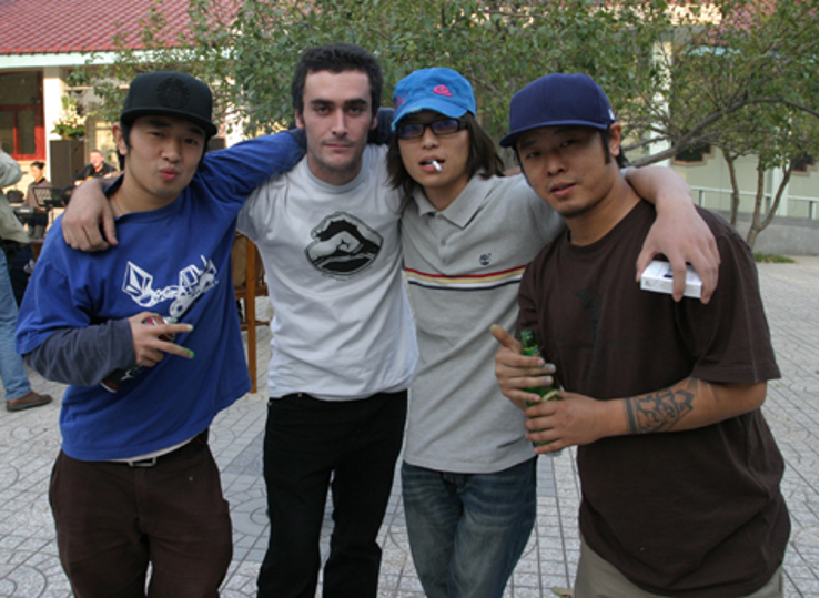
If truth be told, the date of their foundation is not entirely certain: in one interview, Li Qiuqiu states that it was around 2005, in another it was 2006 (ivi, p. 369), and on one of their blogs they mention February 2007. This is due to the informal nature with which the crew was formed: they are a group of friends who met almost by chance and share a passion for graffiti and (in several cases) skateboarding, which was the reason for their collaboration. 41-year-old More, whose real name is Wang Mo, recounts that he met Li Qiuqiu, the crew’s veteran, through skateboarding, and that the Beijing Penzi crew was born out of their desire to do something together (film Crayon 2012). Zak, whose real name is Zhang Lei, says that the idea to join the crew came after meeting More at his friend’s Soos’ birthday party. Only later did he have the opportunity to get in touch and hang out with Li Qiuqiu. In short, the foundation of this crew springs from a series of fortuitous and fortunate coincidences.
Beijing Penzi is an all-round crew. As authors of both elaborate pieces and night-time bombing (which they love the most), the crew members collaborate with famous brands, and also create socially motivated works. They use both the Latin alphabet and Chinese characters in their large-scale works as well as in their tags or lettering on the side of their pieces, and all three Chinese co-founders of the crew (0528, Soos and More) write in both Latin letters and Chinese characters.
Moreover, many figures animate the pieces of these writers, not only the large works but also the quick acts of street bombing, always with a keen eye on bringing out their Chinese cultural background. Still, the presence of the French artist Als proves the internationality and openness of the crew. Als undoubtedly influenced the development and evolution of the style of the entire group with his western background.
In the words of Li Qiuqiu, the name Beijing Penzi 北京喷子, which means “Beijing writers”, was chosen because the term penzi – literally meaning “sprayer, atomizer” and, by extension, “writer” – is used in the Beijing dialect to refer to a garrulous person, and is also the name of a firearm. These two meanings tell us a lot about why the crew was created and what its programmatic aim is. As a matter of fact, according to Li Qiuqiu “[…] We would often have fun bombing together with friends, and so we decided to start our own crew” (interview, 2016).
The idea behind the crew is therefore to reproduce a loquacious expressiveness that floods the audience of passers-by with a thousand words, using the force of a gunshot, but replacing bullets with written messages. What unites the members of the group is the pleasant sense of fulfilment that bombing gives them.
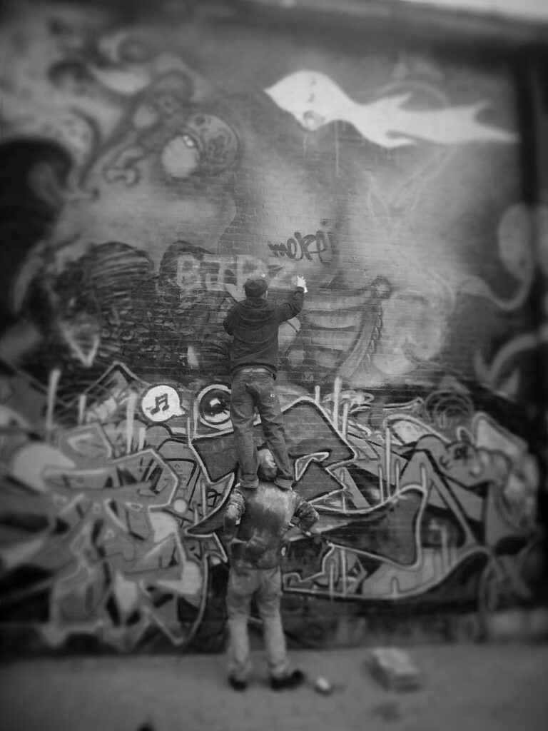
The name of the crew also reveals their background and other purposes that hold them together:
It’s not difficult to understand, from the name of our crew, that we come from the streets. We grew up immersed in the underground culture and we want to carry it forward and promote it. We wish to change the perception of graffiti art and make sure that graffiti is no longer seen as scribbles on the walls but can be accepted and appreciated by everyone. […] Our aim is to make graffiti in as Chinese a style as possible. All over the world graffiti is made using the English alphabet, but ours is not. In our works, we want to represent traditional architecture, the faces of Chinese people […] and Chinese writing, which is unique in the world. We don’t care what others may think of us, this is what we want to keep doing. That’s what graffiti is for us: we “play” with our culture. After all, we are “the Beijing writers” (Beijing penzi) and our background comes from the city most steeped in culture in all China. (Ibid.)
Therefore, the goal of their art is to develop a style that mirrors their Chinese origins (Valjakka 2016, p. 361). Indeed, in their works we find pieces in Chinese characters, Chinese writing and figurative elements that constantly recall the world of “China”.
In memory of the Sichuan earthquake victims
The Beijing Penzi’s 2008 work entitled R.I.P. 512 Sichuan Earthquake (Pic. 4) is representative of their idea of graffiti art. It was created on one of the outer fencing walls of Renmin University, one of the most important halls of fame in Beijing, by Soos, 0528 and More, to commemorate the victims of the devastating earthquake which occurred in the Sichuan region (north-western China) on 12 May 2008, causing around 70,000 deaths.
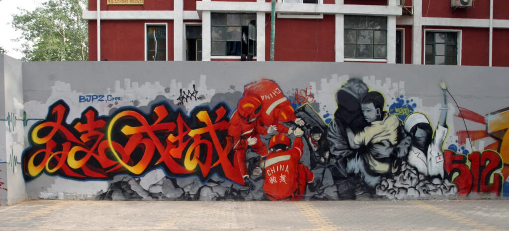
The acronym R.I.P. in the title of the work means “Rest in Peace”, a farewell from the crew to those who died in the tragedy. The work is composed of a portion with Chinese characters on the left, in which a chengyu (a four-character idiomatic phrase) reads Zhongzhichengcheng 众支(志)成城 (unity is strength). This is an incitement not to be discouraged even in the darkest moments, but to work together to face the immense catastrophe and find the strength to recover.
The four characters composing the chengyu fade from red to yellow on a black background, and their style resembles the running or semi-cursive script (xingshu 行 书 )19The running or semi-cursive script (xingshu) is one of the five fundamental styles of the Chinese art of calligraphy, along with regular script (kaishu 楷书), seal script (zhuanshu 篆书), clerical script (lishu 隶书) and cursive script (caoshu 草书). used in Chinese calligraphy, in which the character strokes are joined together by a single quick stenographic stroke. Its thickness varies constantly, its shapes are rounded, and the beginnings of lines are evident and allow the public to mentally retrace the agitated rhythm of this spray “brushstroke”. Altogether it reproduces the upheaval and brutality of the event. The gestures and poses of the figures portrayed next to the written portion echo the agitation of such moments. To the immediate left, three rescuers from the National Rescue Team, wearing red jackets and helmets, work tirelessly to remove the rubble with their bare hands, trying to save a little girl from the wreckage. The expression on the child’s face is one of terror and all around her is death and despair. By her side, there is a hooded young man with a blurred face trying to rescue another crying child, holding him steadily in his arms. Next to him there is a masked nurse, whose face is unrecognizable, calling for reinforcements with her arm raised. They are all symbols of the kind of humanity that, in the midst of so much despair, rolled up its sleeves to help those in need, and represent the unity of purpose and aid20In this chengyu the character zhi 志(will, aspiration) was replaced by the homophone zhi 支 (to support, sustain, bear) precisely to emphasise the juxtaposition of intent and help. proclaimed by the slogan in characters.
The 3D style number 512 completes the work and stands for the date of the catastrophe, which occurred on the 12th of May. The fill-in colour is red, like the blood that was spilled, while the black depth represents the darkness of the catastrophe, and the yellow outline21Outline (lunkuoxian 轮廓线) – The letter outline, the contour line of the piece that defines and shapes its structure: the outline put on the wall and then filled, or the final outline done around the piece to finish it. Can also refer to the drawing done in a piece book (see Black book) in preparation for doing the actual piece (see Sketch). is a longed for glimmer of light highlighting the importance of the number. At the top of the work there are the artists’ signatures: from left to right we find the names BJPZ Crew in blue, followed by SOOS in black, 0528 in red, and MORE in yellow. On the left side, there is one last inscription on the protruding edge of the wall: Jinian Sichuan 纪念四川 (Commemorate Sichuan). The highly graphic cursive style with which Soos created this element, repeated in the penzi 喷 子 (writer) characters situated vertically below it, recalls the zigzagging of the seismograph waves reproduced to the side, and stands as a reminder of the earthquake.
Underground Basketball
In addition to pieces with a strong social content, Beijing Penzi has created several works on commission. As Li Qiuqiu stated, the crew has collaborated with various brands, like Tiger Beer (part of Heineken Pacific Asia), Lee Jeans, Casio G-Shok (a wristwatch brand), Adidas, Nike, Panasonic and Haier (a Chinese home appliance company). We should also remember that this crew had a commercial orientation even before it was founded: as early as 2001, Li Qiuqiu and his friends created a brand called Shehui 社 会 (Society) linked to the world of skateboarding, with the purpose of promoting events, activities and products connected with spreading this sport in China along with its related cultural industry22The Shehui often collaborates with brands related to hip-hop, street culture and graffiti. The company organises independent concerts, promotes hip-hop music, designs skateboards, has recorded several music albums on skateboard culture in China and designs hip-hop themed clothing, CDs, billboards and other merchandise. Over time, it has become central to China’s underground culture and its related brands: https://mp.weixin.qq.com/s/ndjrivhNpMFqG9DzEOBFpg (last accessed in February 2024). . A few years later, together with the other members of the crew, Li Qiuqiu opened a design studio in Caochangdi – one of the most important art districts in the capital – where he could sell his art, write graffiti on commission, and keep decorating skateboards and other similar objects (Feola 2013)23The studio is no longer active. However, Li Qiuqiu and other members of the crew have opened their own private studios where they continue to create graffiti for commercial purposes. .
The most famous among the crew’s commercial pieces was the one created in 2007 for Nike (Pic. 1).
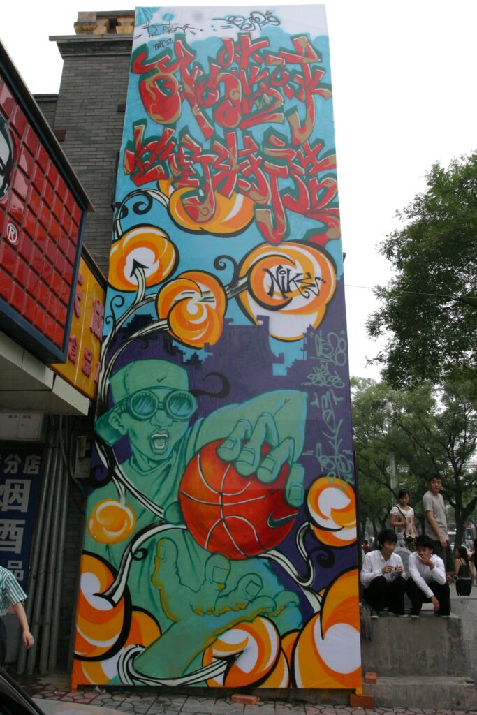
At the time of its creation, it was the tallest graffiti piece in China: 10 metres high and 3.15 metres wide24The record was surpassed in 2008 by a Kwanyin Clan work on a 20m high tower. ! It took Soos, 0528 and More two days to complete, and they only employed spray cans for its creation. As in the previous piece, here we find an inscription in Chinese characters, together with a figure with Chinese somatic features and traditional Chinese decorative architectural elements. The work is thus close to a manifesto of the search for “Chineseness” that the crew’s works strive for. The inscription in Chinese characters can be found in the top section of the piece and stands as its title: Wo de lanqiu you jietou dazao 我的篮球由街头打造 (My way of playing basketball is born in the street). It recalls the underground street culture of New York’s inner city and of Chinese cities, where playing basketball is a way to hang out with friends. The inscription sets out to connect the place where graffiti art was born, the USA, to the place where it is now developing, China, while obviously referencing the sport that is the subject of the commercial advertising requested by Nike. The characters are written in 3D style, the fill-in colour is red with beige inlays, decorations and underlines, and the outline is white with dark green depths. This triumph of colours and decorations underlines the sense of light-heartedness with which the piece is imbued. The writing style is rounded and playful, calling to mind the idea of leisure associated with the theme of the graffiti. In the lower part of the piece, a puppet represents a basketball player intent on juggling the ball in the street. He is wearing a pair of dark glasses and a cap slung backwards, which make us think of an outdoor game. His hip-hop look seems to bring him very close to the creators of the piece, but the extremely large hands with which he catches the ball, on which the Nike logo is clearly visible, are a good reminder of the purpose of the work and its commissioner. The outdoor setting is also highlighted by the purple background, over which the player stands out. The skyline is an ancient Chinese city with pagoda roofs and a temple in the middle, a distinctive element of the work of 0528. The whole piece is executed in a very captivating cartoon style. The graffiti is framed by a vine full of yellow buds, which is a recurring element in Soos’ works and his second signature. Inside one of these buds, right in the centre of the work, stands the inscription “Nike” and, below it, the three tags of the authors of the piece (0528, Soos and More) and that of BJPZ.
The piece was created on a panel installed on the outside wall of a Yaxin shop selling branded Nike products in China. The shop is located in Dongsi, in the city centre near the Forbidden City, and represents one of the sanctuaries of sportswear in the capital. Right beside the shop stands a KFC (Kentucky Fried Chicken), the American fast-food chain restaurant specialised in fried chicken, which is very popular in China. Although some might disapprove of it, the location chosen by BJPZ is an emblem of the American-style Chinese consumerism typical of our times. Graffiti, born to fight this kind of inequality-generating society, here integrates to perfection with the surroundings, even becoming an unexpected catalyser and promoter of a hyper-consumerist and disengaged society. There appears to be an inherent contradiction; so why? What lies behind the need to make such graffiti?
When the crew is asked why they commit to this kind of commercial activity, they answer that this is the only way to earn money to be reinvested on the streets. The crew uses their earnings to buy spray cans for their favourite activity: bombing the streets of Beijing at night.
Street bombing
The BJPZ tags covered the city for a few years25BJPZ Crew, Beijing graffiti BJPZ CREW BOMBING IN BEIJING 北京喷子涂鸦团队, video, 6’28’’, published on YouTube by More-BJPZ on 14 December 2008: https://www.youtube.com/watch?v=3aUl90pXX2w, especially the 3.3 underground car park in the Sanlitun neighbourhood, the 798 Art District, the overground Wudakou line, Nanluoguxiang street in the city centre, the Dawang bridge and the Xinjiekou area, as well as some of the main highways connecting the city, more precisely on Third and Fourth Ring Road North and the Third Ring Road West. Besides the traditional tagging-up, the 3D or bubble style throw-ups, and some bubble style blockbusters (mostly with the name Beijing Penzi), the crew members enjoyed playing with puppets or easily recognizable stylised figures in writing their tags (Fig. 4). 0528 draws young boys’ faces with oblong heads and typical Chinese features (Fig. 4, on the right); More, whose tag seems to reproduce a flattened face with a beak and two large ears, adds a fun cone-shaped puppet with two prominent incisors and round ears (Fig. 4, centre); and Soos paints a Xiao R (小R, Young R), a puppet with a flame-shaped head featuring only two dots serving as eyes, tapering hands and feet, and a stout body (Fig. 4, on the left).
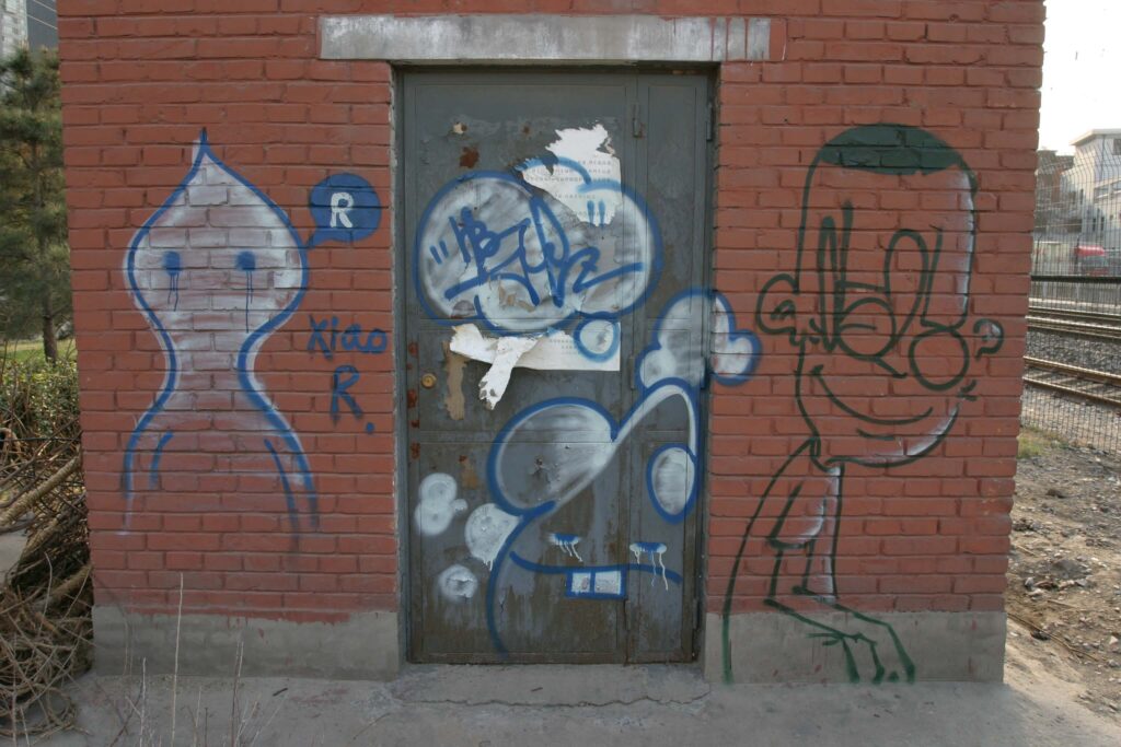
This puppet is reminiscent of the shape of a virus whose task seems to be that of infesting the streets. When painted together with More’s puppet, Xiao R is often accompanied by swirls and a beating heart, as a clear reference to the passion bonding these strange characters. The swirls, called xiandao 线 道 , literally “roads of lines” (Llys 2015), are a second recurring feature in Soos’ works. They became his signature style, together with another element he invented, the “jellyfish clouds” (shuimo yiyun 水母意云): little cloud-shaped floral outgrowths arising from the tentacles of a jellyfish. The idea of the jellyfish is echoed in the sinuosity of the stems of these strange pom-pom flowers (see the buds in Pic. 1). The inspiration for the jellyfish clouds comes from the Kongming deng 孔明灯, a type of oil lamp with steam vents invented by one of the greatest strategists of ancient China, Zhuge Liang (181-234), whose public name was Kongming. The jellyfish clouds, together with Chinese writings, faces, and architectures, are meant to enhance a sense of “Chineseness”, often expressed in BJPZ’s works.
Li Qiuqiu, the forerunner of Chinese graffiti
The intense bombing activity that has been a feature of BJPZ since its foundation has decreased over time. After a few years of hard work on the streets, the crew members are now actively working mostly on commission, and only rarely do they have time to create on the streets (Valjakka 2016, p. 361). The reason is that most of them have families, therefore the time on their hands is limited and they need a more stable occupation to provide for their household. For example, Li Qiuqiu is now the father of twins and, therefore, has little time for graffiti, especially those on the streets that fulfilled him the most (Huang 2016). In fact, as he states himself, although the crew is still active, each of its members now has other jobs, making it difficult to create pieces all together (interview, 2021).
Among the various members of the crew, Li Qiuqiu is the only one to have really made graffiti history, not only in Beijing, but in the whole of China. He is considered by many to be “the father of Beijing graffiti” and the leader of the movement. For this reason, he earned the nickname of “old boss” (laoda 老大) (see Video section, film Crayon 2012). Li Qiuqiu was born in 1978 and is now 46 years old, but he started creating graffiti in 1996 (Valjakka 2016, p. 361) when he was only 18. At the beginning he did not write; instead, he depicted simple figures with his spray cans. Around 1999-2000, he started to write his tag 0528, marking his territory around the old city of Beijing (Wang 2016).
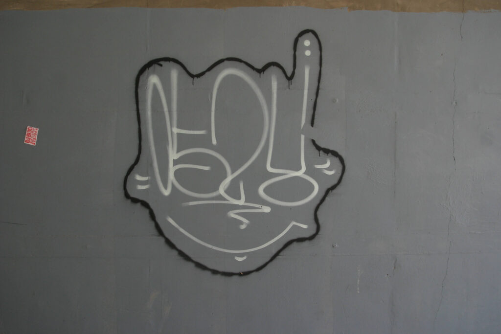
Actually, when asked when he started graffitiing, Li Qiuqiu answers: “I believe that everything dates back to my elementary school days; I have loved to paint ever since I was a child, and back then I often used chalk and brushes to draw and write on walls” (interview, 2016).
In short, he was born to be a writer – one who initially, however, lacked a tag. About this choice, Li Qiuqiu recounts: “0528 is a reference to my birthday [the 28th of May]; I chose this tag in the hope that everyone would remember when I was born!” (interview, 2016). This may sound a bit eccentric, but is reminiscent of the numeric tags of the first writers in New York, although those were linked to the street numbers of their homes. By using his birthday as his personal tag, 0528 would later be emulated by a member of another important Beijing crew the TMM crew, whose tag is 525 as a reference to the writer’s date of birth, the 25th of May. Li Qiuqiu thus seems to have set an example even in the choice of tag, but his influence goes further than this.
Li Qiuqiu’s initiation to graffiti art is linked to another of his great passions: skateboarding. Indeed, Li Qiuqiu often went to the Wudaokou neighbourhood to practice with his skateboard together with friends, and this offered him the opportunity to soak up the hip-hop culture (Huang 2016). As we already mentioned, it was thanks to this passion that he met More, and they subsequently came up with the idea to form the BJPZ crew (for More, see ibid.). In 2001, he also founded the Shehui 社 会 (see § Basket underground) brand together with other friends, which is still very active today and for which he continues to work, dealing with graphics and brand dissemination.
Although Li Qiuqiu never disdained the commercial side of graffiti, the main purpose of his art is strongly linked to the old school and the wish to bomb the city with his tags and pieces as an act of denunciation and rebellion, even though his works are actually neither seditious nor subversive. More than 10 years ago, 0528 refused to create Olympics themed graffiti in the 798 Art District, even though commissioned by the government. This was because, as he says, he wanted to feel free to do whatever he wanted, wherever he wanted, never allowing things to be imposed from above (film Crayon 2012)26Furthermore, there was no reimbursement for the canisters, nor compensation for the work done.. Since he sees himself as a free spirit, his “contacts” with the police have not been at all rare (Wang 2016)27An interview with Liu Qiuqiu reported by Wang 2016 reads: “Numerous times, he was stopped by the city’s chengguan [city inspectors], fined, and ordered to paint over his tags.”. As he recalls, the first encounter was during high school, when he was making graffiti near the Temple of Heaven, one of the city’s renowned monuments. The policemen confiscated his ID card, which his father demanded back the next day, provided Li Qiuqiu restored the wall to its original condition before his intervention. His worst experience was in 2010, in Amsterdam, where painting on walls is a crime. He was arrested, held in custody for 24 hours and had to pay a fine of 370 euro to get out of prison, an exorbitant amount for his means! The funniest anecdote happened in 2006 in Tianjin, a big city close to Beijing. On that occasion, the police approached him while he was making graffiti on a government building wall – the Municipality– which was considered utterly unacceptable. They took him to the police station, but here one of the policemen declared he knew and liked his art. He mentioned to his colleagues that the person they had detained was an artist and, through his intervention, Li Qiuqiu was released after 24 hours of custody without even having to pay a fine (film Crayon 2012).
These “encounters” with the police were frequent also for the other crew members. For example, More said that he and other writers happened to be picked up by policemen quite regularly because they mostly bomb at night. For him, the most troubling experience happened while creating graffiti in Shanxi, a region near the municipality of Beijing, where he had to pay a 300 yuan fine (around 40 euro) to be released (ibid.). Zak, on the other hand, was first detained by the police when he was writing his tag with a marker28Marker (makebi 马克笔) – The pen used to paint tags. on an underground carriage door at the Andingmen station in Beijing. As he explains, this was the first of a long series of arrests, and every time the police forced him to cover up his writings. From his own experience, he also learned that during festivities and major city events, detention is more likely because police checks are more frequent (ibid.). Unlike Europe, China has no specific law regulating vandalism on walls, so writers are generally tolerated, and punishments are minimal – usually small fines or an order to cover up their work – although this does not mean going unnoticed by the police. However, as experienced by Li Qiuqiu in Amsterdam, things are very different in the West!
Besides being considered the father of Beijing graffiti, Li Qiuqiu is certainly a pioneer of the development of a “Chinese style”. He was arguably the first to experiment with the use of Chinese characters in his graffiti, or at least his are the first of which we have photographic evidence. Indeed, among the first pictures of pieces with such characters in Beijing are two works by Li Qiuqiu (Pic. 2, Fig. 5). These were captured in 2005 by Liu Yuansheng (a.k.a. Llys), a retired professor with a passion for photography who has been documenting the development of local graffiti art since 2004, going around the city in search of works to take pictures of and share through his official blog.
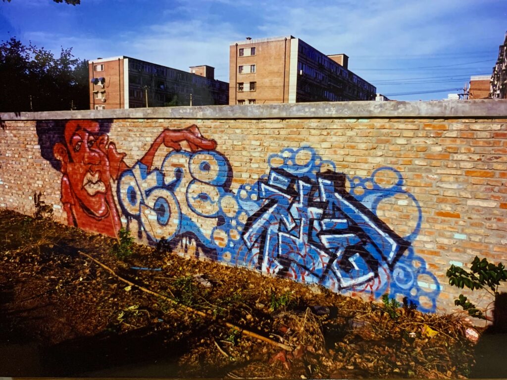
In the first work (Pic. 2), Li Qiuqiu painted the head of a black man on the left, his tag 0528 in the middle, and the two characters of the brand Shehui 社 会 (Society) on the left. The character depicted is typical of the initial stage of his career, when he used to draw enormous heads of men with half-closed eyes, full lips, a snub nose, sometimes with sunglasses and a bald head or with the features of a man of colour. The style is always caricature-like, and the idea behind these big heads probably comes from the giant profiles used by Zhang Dali in his series Dialogue and Demolition (Fig. 2). Li Qiuqiu himself admits that Zhang Dali was somehow an influence for his art (Valjakka 2016, p. 361), together with other street artists like Banksy, Bonzai, Hobey, Kobra and Chinaman (Li 2016)29In the same interview (Li 2016), Li Qiuqiu affirms that the comics of Otomo Katsuhiro and Kim Jung Gi were further sources of inspiration for his art. On the other hand, his music references are 2pac, Nan, Wu Tang, Bob Marley, Mozart and Paquito (D’Rivera), and he is a fan of the literary works of Wang Shuo, Jin Yong and Gu Long. His family and friends also had a strong influence on his style.. As for the structure of this work, we can see the tag 0528 in the middle, rendered in 3D style with blue and light blue double depths and no fill-in. The tag is stroked by the large hand of the curly-haired character on the left, introducing a sense of continuity between these two elements. The colouring and the sinuous progression of the writing evoke sea waves, and the drips under the number recall an aquatic atmosphere. It is not by chance that the two Chinese characters on the right stand out on a background of blue bubbles, the same colour as the writing: the fill-in is light blue, the outline is white, and the depths are blue. The work was created in Wudaokou, one of the most international and graffiti-rich neighbourhoods in Beijing, on the enclosing walls of a residential area that isolate it from the rest of the neighbourhood, like a ghetto markedly separating the wealthy from the rest of the population. The place was not chosen randomly, but obviously hides an underlying social criticism. The writing style used for the Chinese characters is geometric and reminiscent of “regular script” (kaishu 楷 书), an easily intelligible calligraphic style where each stroke is distinct and discernible.
We can find an evolution of this geometric style in works like Bie feihua 别废话 (No superfluous words, 2006), whose lines reveal the influence of the graphic style used in the tagging-up and of the bubble style used in works like Penzi’er 喷子儿 (2005, Fig. 5).
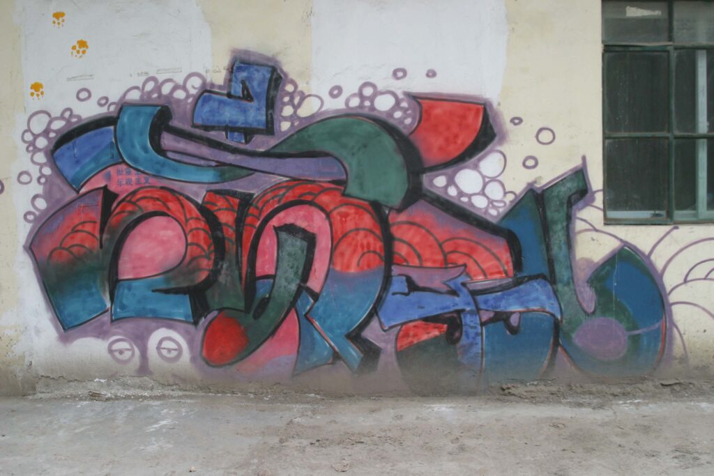
Compared to Shehui 社会 (Pic. 2) of 2005, in works like Bie feihua or others created slightly later some of the strokes are rounded and appear more fluid-like, without however losing their geometric shape completely. This leads to Li Qiuqiu’s writing style, in which the strokes are sometimes rounded, sometimes orthogonal, in a skilful interplay of delicate balances.
The second piece with Chinese characters from 2005 of which we have photographic evidence is Penzi’er 喷子儿 (Fig. 5). It was created at the 798 Art District, another historically important place for Beijing graffiti. It is composed of three characters, pen zi er 喷子儿, which together mean “writer”. The first two characters are the same used in the crew’s name (penzi), to which the suffix er “儿” – a typical ending of the Beijing slang – is added. This small addition made the authorship of the piece, or at least the writer who created it, unequivocal. The writing style thoroughly differs from the other 2005 work (Pic. 2): this features a very rounded bubble style in which the character strokes are joined together, as in running script (xingshu). 3D style is employed too: the fill-in is a triumph of colours and nuances ranging from blue to green and red, while the depths and outline are black. This mixture of styles, with multicoloured three-dimensional characters written lengthwise30Charactering – Term we have coined to designate the style of characters in writing pieces (see Lettering), or the use of Chinese characters in graffiti., whose strokes are stretched, rounded and stenographic as in running hand script, and in which the thickness of the strokes always varies like in calligraphy, is a very distinctive stylistic feature of Li Qiuqiu’s works. As in Shehui (Pic. 2), the background is a tangle of bubbles, waves are depicted within the characters (in the central section), and the face of a seal (or penguin) appears in the bottom left-hand corner. All elements that, again, are reminiscent of aquatic settings. Thus, through the marine atmosphere, in these first two pieces (Pic. 2 and Fig. 5) Li Qiuqiu seems to disclose a world in which everything – waves, bubbles, architecture, walls, street art – is fluid and fleeting, while also granting a touch of liveliness to the composition, as we occasionally find in his graffiti.
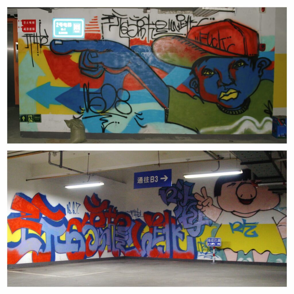
Another important work in which Li Qiuqiu abundantly employs Chinese characters is the one he created in June 2006 in the underground car park of the 3.3 mall, in the Sanlitun neighbourhood (Fig. 6). This piece was part of a work commissioned to 0528 and other famous writers by the owner of the mall, with the purpose of attracting young customers. The project proved so successful that it was repeated in 2011, and some of the graffiti made on that occasion are still standing today (Bonniger 2018, p. 22)31US journalist Lance Crayon, who was sent to report on the event in 2011, was so impressed that he came up with the idea of the first documentary on graffiti in Beijing: Spray Painting Beijing. Graffiti in the Capital of China..
Li Qiuqiu’s piece, which stretches over two different portions of the wall, consists of two puppets, an inscription in Chinese characters, and various other one-liner Chinese and English writings. The first cartoon style puppet depicts a little pig with a helmet, her fingers raised in a sign of victory. She is portrayed wearing a summer dress with the character chi 吃 (to eat) at the centre. Next to her is the large inscription Wan 65 jiu shi xintiao 玩 65 就是心跳 (Playing 65 is heart-stopping). The number 65 refers to one of the biggest online videogame platforms in China and expresses the intent to target a young audience. The 3D style is achieved with striped red and light blue fill-ins, and purple depths and outline. The charactering style is reminiscent of running script with many strokes joined in a single “brushstroke”. The strokes are always sinuous and rounded, like marshmallows. This style is the upgrade of the artist’s early bubble style and will often be used by Li Qiuqiu in other pieces (Fig. 5).
The expression in characters Wan 65 jiu shi xintiao 玩65就是心跳 can also be found on the second puppet’s cap. Here, the calligraphic style is similar, but the strokes are simple black lines obtained by means of a single spray of paint. The same captivating graphic writing style also occurs in the word “Fuck” on the puppet’s cap, in the characters kaishi 开始 (lit. to start) placed in the direction of his finger, and in the tag 0528 below his hand (the last two elements are also found in the other section of the work). The dots with which the lines end and the decorations that highlight them are typical of the style adopted here. This type of writing is also found in many of Li Qiuqiu’s later works, particularly in his tags.
The second puppet is a writer, or in any case a young man imbued with hip-hop culture, as is clear from his clothes (cap and large T-shirt), his grumpy expression and the insulting word on his cap. He has the features of 0528’s puppets (large face, almond-shaped eyes, full lips and snub nose) and the somatic traits are those of a young Chinese man. The puppet’s colours are unrealistic (purple skin, yellow mouth and eyes, red shading), but recall the colours used in the other section of the piece and in the arrows in the background. The choice of the puppet is certainly linked to the work’s target audience and to the intention of offering an alter ego of the non-conformist soul of the new generation, with which young people can identify.
Even though it is a commercial piece, this graffiti is of great importance for the stylistic development of Li Qiuqiu’s art because it displays writing styles and characters that will become representative of his future production: the writing style of the characters will be found in other similar works done on the streets, the puppet of the young writer is a clear evolution of the balding heads and faces depicted before, and the single black line writing style will become a signature of his later works. This writing style will also feature in a recurring expression used in his graffiti, Bie feihua 别 废 话 (No superfluous words), generally used in his bombing activity.
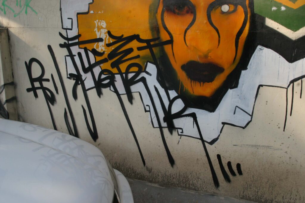
The style is very graphic, with stretched final strokes, and numerous circles and hooks. It stands as a warning against the meaninglessness of language currently pervading everyday life, and against the flooding of political, social and economic information to which we are subjected on a daily basis. This over-exposure to language often leads to a loss of meaning, now as in the past. In China, a similar process occurred during the years of the Cultural Revolution (1966-1976), when everything was reduced to slogans – forced and meaningless repetitions of propagandistic statements. Li Qiuqiu, instead, appears to tell us that language is a serious matter, and that words must be weighed and not wasted; rather, they should be selected and filled with meaning because narrative is what creates meaning, and narrative is nothing but a “meaningful” concatenation of words – interesting food for thought for passers-by, who absent-mindedly come across these writings while strolling around the city.
As mentioned, Li Qiuqiu often uses the Chinese language in his works in an attempt to grab the attention of his audience and make his pieces understandable. To do this, in addition to characters he uses many Chinese visual elements, favouring faces with oriental somatic features (Fig. 3) – which sometimes look almost like caricatures of Mao (as in one of his graffiti created in 2006, again in the 3.3 mall car park) – dragons (as in a 2012 piece where an enormous dragon holds a mah-jong tile in his claws), or bamboo and lotus flowers on plum branches. Why does Li Qiuqiu choose these very elements? The Chinese face is something viewers can identify with, and the depiction of Mao is emblematic of modern China, being an image to which Chinese people are used, if not inured. Suffice it to consider the propaganda posters that covered the walls of the city during the Cultural Revolution (Landsberger, Min, Duo 2015) and the huge portrait of Mao that still stands in Tiananmen Square, looming over the red walls of the Forbidden City. The dragon is the most prominent creature in Chinese tradition and represents the emperor’s alter ego. The lotus flower is another symbol often associated with the East, being the Buddhist emblem of purity. Finally, the bamboo and the plum are considered two of the so-called “four noble ones” in Chinese pictorial tradition: the straight, evergreen, hollow and blending bamboo symbolises modesty, honesty, rectitude and open-mindedness, characteristics which are traditionally attributed to the perfect Chinese gentleman (Illouz 1989, p. 57); while the plum, with its bare, gnarled branches dotted with delicate little flowers, embodies vigour, longevity, endurance and independence (ivi, p. 60).
Thus, the use of these elements in his graffiti shows Li Qiuqiu’s effort to draw on Chinese tradition and evoke its rich ancient culture, as declared in the crew’s intentions. The goal is to bring Chinese people closer to graffiti – an unfamiliar art form – through familiar elements, and, at the same time, bring some “Chineseness” into his art, so as to make it unique.
Li Qiuqiu did not merely portray this universe; he reinvented it in a perfectly innovative way. Not only did he rethink graffiti in caricature or cartoon form and rearrange traditional elements (for example, sometimes portraying lotus flowers on plum branches). He took things further. He brought to life a completely new and distinctive Chinese entity called Fangshen 房神 (Spirit of the House), inspired by traditional architecture, and made it one of his stylistic features. This entity is the personification of the traditional Chinese house (Pic. 3): its front door is the rapt face of an almost meditative or perhaps somnolent spirit, the roof serves as its hair or a kind of sumptuous hat, and the small columns at the side of the door become two long locks of hair contouring the face. Chinese lanterns sometimes sprout from the two locks of hair, resembling elastic bands from which other fringes of fake hair emerge. In some graffiti, we see the body of the spirit below the “architectural” face, wearing traditional clothes, as well as the enclosure walls of the house that extend to the right and left of the doorway in a circle and become a supporting element for a large bamboo basket on the spirit’s shoulders, full of mountain peaks and white clouds. The peaks are reminiscent of the so-called “Sacred Mountains”, home to the Taoist deities, while the clouds resemble the traditional “decorative cloud motif” (yunwen 云纹), often found in ancient Chinese artifacts. Finally, the hands and gestures of the spirit occasionally seem to mimic typical Chinese martial arts poses or certain mudra (hand positions) of the Buddha. In the same way, his face can transfigure into the shape of a panda, one of the symbols of China.
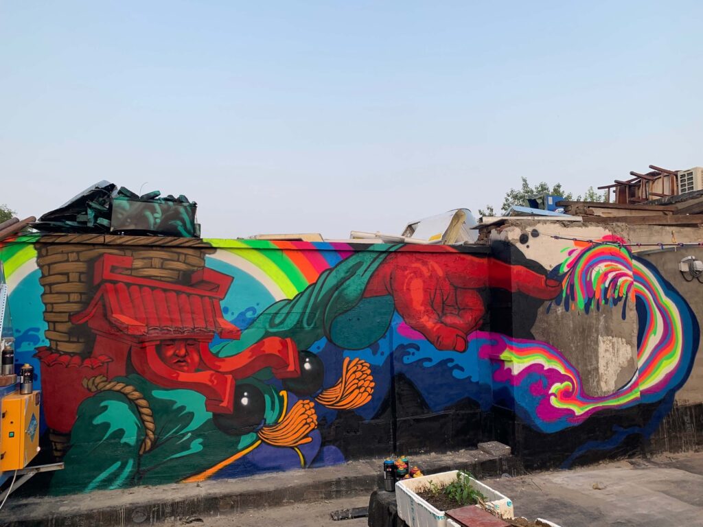
Hence, everything about this “Spirit of the House” evokes its unmistakably Chinese origins. Even its name originates from a folkloristic belief: in China, the term “Spirit of the House” designates wild plants growing on the roofs of houses to anchor the tiles, making them more stable. The name washen ( 瓦 神 ) – “spirits of the house”, “deities of the tiles” – comes from this. These plants were considered a good omen for the family members living in the house on which they grew, and they were also used in Chinese pharmacopoeia to treat injuries. They are very resilient since they grow in harsh conditions and withstand all kinds of weather. By choosing the name Fangshen, Li Qiuqiu thus seeks to evoke the spirit of resistance and resilience embodied by these plants, calling for its return to the old neighbourhoods of his city, which are increasingly being disfigured by aggressive and brutal property speculations. The puppet’s name was later changed to Fanxian (梵仙, celestial figure called Fan)32This is the translation provided by Li Qiuqiu. As he stated in a WeChat conversation with A. Iezzi (16 March 2021), he usually transliterates the term first and then translates the meaning., with Buddhist and Taoist references. Fan-xian can be literally translated as “immortal Buddhist”: in Chinese, Fan 梵 means “Buddhist”, while Xian 仙 means “immortal Taoist”. This because Li Qiuqiu believed the name to be more romantic, with a more poetic, less direct and immediate flavour. The idea of “spirit, deity” (shen) has thus been replaced by “immortal” (xian), which are two distinct concepts. The spirit or deity is an entity that resides permanently in Heaven, while a Taoist immortal is a person who has earned eternal life by practising asceticism and austerity. The artists thus chose to emphasise the link with worldliness and factual human origin.
As Li Qiuqiu explained:
It is a series I started thinking about in 2003, inspired by people who work carrying goods on their backs in the mountain areas of Yunnan (a province in southwest China). In everyday life, we all seem like machines that repeat the same actions, tasks and daily routines over and over again. That is exactly what happens to these mountain carriers, even though they endure quite a different lifestyle. They keep going despite their hardships. I was inspired by their spirit, their bravery before difficulties and courage to take responsibility. I therefore combined the most oriental architecture with the baskets on the shoulders of these mountain carriers to mirror the attitude and the place where I come from. I dressed up various puppets and animals with this harness and portrayed them in a half cartoonish, half realistic style to give them the divine aura of celestial creatures. From my studies of Buddhism and Taoism, I realised that becoming immortal or a deity is not the ultimate goal; the aim is rather to convey love and good- heartedness. This is what inspired the name Fanxian. I have always sought to express experiences, feelings and states of mind through an exemplary and distinctive image […]. (Interview, 2021)
Although Li Qiuqiu imagined the Fanxian in 2003, he first portrayed them in 2007, using canvas for his early experiments. In that same year, 0528 started depicting traditional roofs on walls, the same that would serve as “hats” for his future Fanxian. The first outdoor Fanxian were made in 2008. The first piece on a wall of which we have photographic evidence was made in the 798 Art District, while the first on a panel was commissioned by Nike and reproduced on the wall of the Nike 706 Art Space at 798 for the inauguration of a Lebron Experience Center project promoting the game of basketball (and its products) in China. From that time on, as Li Qiuqiu himself states, Fanxian became the symbol of his art (interview, 2016). This element is still very much present in his work and appears in various guises: a lute or flute player, a panda or tiger, a surfer or seal, its transformations allowing us to retrace all the stages of Li Qiuqiu’s stylistic evolution. The most successful combination of the Fanxian with its setting may be found on the walls of buildings under demolition. In such instances, the graffiti seem to restore a soul to places from which it had been stolen and shattered, making these soon-to-disappear constructions “immortal”. This is the function of such celestial creatures: to continue inhabiting places that, even when materially demolished by the fury of bulldozers, are still “spiritually” alive and narrate the lives of the people who once lived there. Li Qiuqiu’s work here acquires a polemical vein and becomes a subtle denunciation against unbridled speculation and the tragic force of the mass demolitions imposed by the government, which have destroyed the historical and social fabric of much of ancient Beijing.
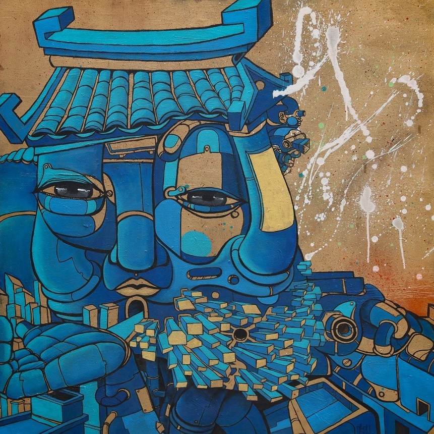
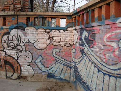
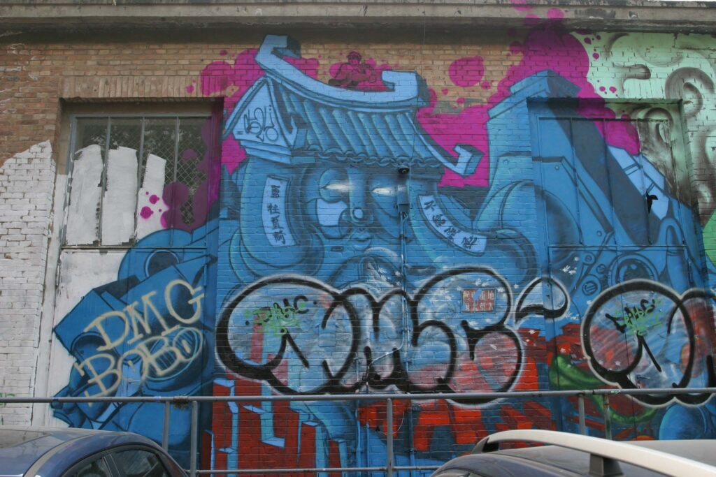
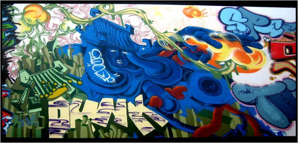
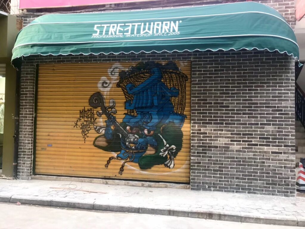
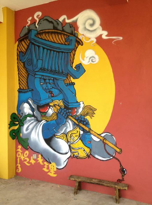
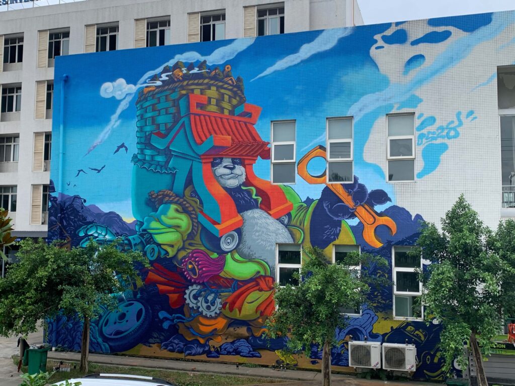
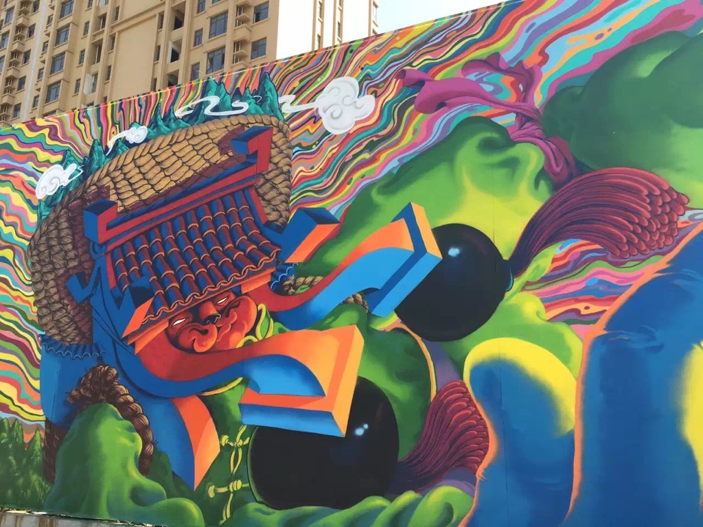
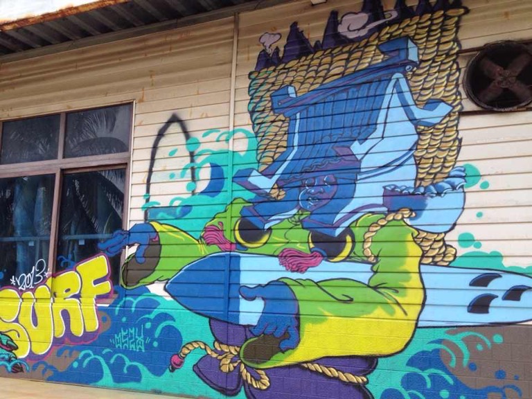
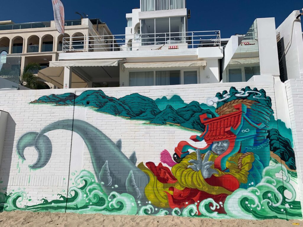
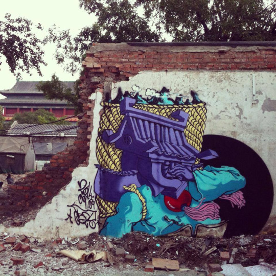
Although Li Qiuqiu’s artistic production is now mainly marked by the Fanxian, he continues to use Chinese writing extensively in his works and to make graffiti consisting of characters. An example of this is a recent work produced in 2020 with Corw, depicting the expression Qingwu tuya 请 勿涂 鸦 (Please no graffiti) (Pic. 5).
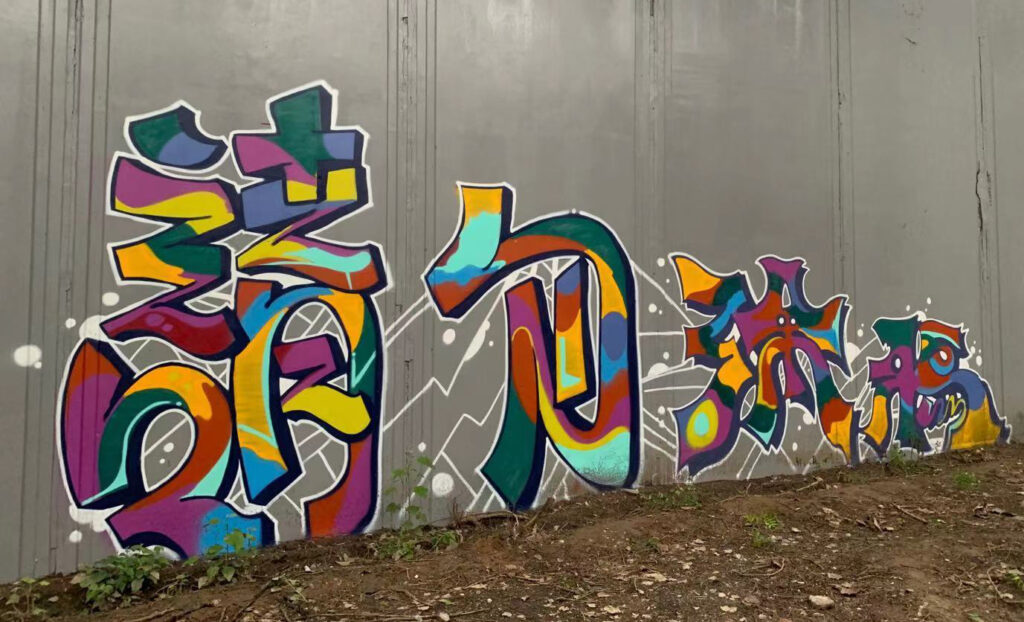
The piece has a distinctly political orientation as it was created on Jingmi Road, Beijing’s most important hall of fame for some time now, and once home – as Li Qiuqiu himself says – to numerous graffiti. Later, these were all buffed by the government and replaced by a long, grey and anonymous wall dotted with the black stencil inscriptions Qingwu tuya 请勿涂鸦 “No graffiti” posted by the government itself.
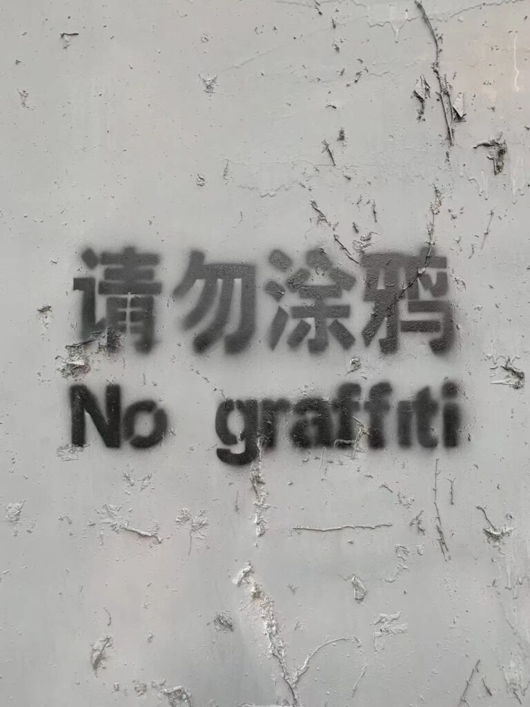
As an act of protest, Li Qiuqiu and Corw decided to paint graffiti with the same text, but using bright colours and fun animations so as to brighten the blank wall that had once been the heart of a shared creativity. As a result of this act of artistic rebellion, many other writers followed suit, once more filling the wall with graffiti: a fine example of a peaceful protest with spray cans.
In conclusion, we can consider Li Qiuqiu as a true pioneer of graffiti art in China and the creator of a Chinese style in which everything can be traced back to its particular authorship, from bombing to elaborate pieces, from simple writing to figurative and decorative elements (which seem to be veering increasingly towards street art). Li Qiuqiu is, in fact, one of the few who managed to move from emulating western styles and stylistic features to creating something new and original that is recognisably Chinese: a true benchmark for the development of graffiti throughout China.
The Kwanyin Clan: searching for a Chinese style
Among the numerous crews that have been operating in the city of Beijing for the past 20 years, the Kwanyin Clan plays a prominent role. The crew was founded in June 2006 in the 798 Art District by EricTin (a.k.a. Tin), Yumi, Quan and Jev (a.k.a. Jer), joined in 2007 by Nat(uo), Ap (Art), Keno, Viga, Jak and Scav (a.k.a. Scar) (Valjakka 2016, p. 361). The number of crew members has always fluctuated considerably. According to EricTin, in 2009 the crew consisted of nine members: Ap, Keno, Scar, Jer, Tin, Yumi, Viga, Nat and Jak, who joined the crew that year; while in 2008 there were 12 members: Daiyan (Quanr), Liu Zheng (Guantou, Eric_Tin), Song Tongshu (Yumi), Zheng Xuezhi (Apart), Jianshu (Jer), Lu Daning (Nat), Xu Yan (Scar), Lu Jiayin (Joey), Tang Mi (Keno), Xu Ou (Pluto), Xue Wenhao (Viga) and Jitou (Ctn) (see Video section, Guanyin 观音 2008).
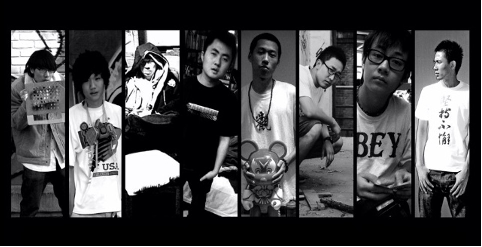
Only four members of the crew are currently active: EricTin, Viga, Jjj and Shala. The number varies, partly due to the sense of openness that characterises the crew. On the other hand, some of its members dedicated only a short period of their lives to graffiti as a hobby, and then returned to more stable occupations, as is widely common among Chinese crews (Valjakka 2015, p. 263).
The Kwanyin Clan is one of the first crews created in the capital and the most representative of a strand of research within graffiti art in China called Chinese Style Graffiti 33Guanyin 观 音 (KWAN-YIN) crew – Chinese Style Graffiti, video, 2’30’’, excerpt from interview by 100du.tv, published on YouTube by billdisc on 27 February 2008(Zhongguo tese de tuya yishu 中国特色的涂鸦艺术), involving the use of Chinese characters and very strong references to one’s own artistic and cultural tradition. The crew’s programmatic intention is, in fact, to merge graffiti art with Chinese culture, spreading this art form in contemporary China. Their Flickr page reads: “Our crew is committed to the dissemination and development of graffiti art in China. Explore the fusion of graffiti art with China, has always been the direction of our crew” (Flickr Kwanyin Clan).
The choice of the crew’s name is also perfectly in line with this intention: Kwanyin (Guanyin 观 音 ) explicitly refers to the Bodhisattva Guanyin, one of the most important deities in the Buddhist pantheon. Bodhisattvas are compassionate sages who forsake the liberation they achieve through bodhi (enlightenment) in order to assist people and guide them to salvation, thus becoming the object of worship and veneration. Guanyin is the Chinese counterpart of the Indian bodhisattva of compassion Avalokiteśvara. The crew’s choice of naming themselves after this sage is due to the fact that, ever since Buddhism spread throughout China during the Tang dynasty (618-907), Guanyin became the most popular bodhisattva in the empire, among the many introduced to China, and continues to be so. This is because, to adapt to the new situation, he underwent major transformations that led him to change his features from male to female. The choice of the name Kwanyin thus implies the founding idea of the crew, according to which graffiti artists, who come from a foreign culture, need to first integrate and merge with Chinese culture and society, to “sinificate” themselves, if they want to be known and loved like the bodhisattva whose name they bear (see Flickr Kwanyin Clan).
The Buddhist echo of the name also reverberates in the first logo designed by the group (Fig. 7), in which the image of the lotus flower, symbol of the Buddhist creed, is repeated twice: on the right, it is meticulously drawn in its traditional form; while on the left it is stylised in geometric form. In correspondence with the corollas, the name of the crew replaces the conventional Buddha figure: on the right it has been abbreviated with the traditional character Guan 觀, which stands for Guanyin, while on the left the name “Kwan-Yin” is tagged in full in Latin letters.
This double signature is often found within the works of the Kwanyin Clan and effectively sums up their creative mission: to create a bridge (represented by their works) bringing China (the lotus on the right) as close as possible to the West (the lotus on the left), in order to “push forward with an overwhelming momentum” the art of graffiti in China, as stated in their motto below the logo. In 2017, the logo was changed and now consists only of the capital letters KWAN.
The peak period of the crew’s activity was from 2006 to 2009-2010. Afterwards, many members of the crew, formerly students of art or design academies in Beijing, graduated and were forced to give up graffiti and devote themselves to more lucrative activities to support themselves and their families (Valjakka 2016, p. 361). The crew’s first piece and mural (a complex, large-format work, covering the entire height of the wall and consisting of several pieces of writing and some puppets) both date back to December 2006, and from these first attempts, approximately one hundred documented graffiti pieces of medium and large dimensions emerged. From 2007 to 2009, the crew participated in the most important graffiti art exhibitions and competitions in China: in 2007, for example, the crew took part in China’s First Graffiti Exhibition and the 798 Art District Graffiti Festival in Beijing, and in 2008 in The Great Way of Graffiti Cultural Festival and the Shijingshan Cultural Festival Graffiti Show. In 2009, they participated in the Action for Seed Graffiti Jam in Shenzhen and competed in the Wall Lords Graffiti Battle in Wuhan34See images and videos on Flickr and Vimeo: https://www.flickr.com/photos/wall-lords/; https://vimeo.com/user2449915.. On these occasions, they usually create large-format outdoor pieces on walls or removable panels (for the Shijingshan Cultural Festival, even on a plastic sheet) with the name of the crew and/or its members written in large letters or characters in bright colours, sometimes together with puppets or decorative elements like clouds and flowers.

As is often the case with Chinese crews, the Kwanyin Clan has regularly collaborated with the local Chinese government, to embellish the urban fabric of Beijing and create “visual propaganda” works (Valjakka 2015, pp. 258-259) to promote the image of a rich, prosperous, long-standing China. One example is the piece Olympic Beijing (Fig. 8), created for the 2008 Olympic Games near the Beijing Institute of Technology as part of the Beijing Olympic Cultural Wall Creative Design Campaign. This campaign was sponsored by the Beijing Olympic Committee, the Beijing City 2008 Environmental Headquarters Office, and the Beijing People’s Broadcasting Station, with the aim of stimulating the creativity of artists in bringing further prestige to the international event and getting citizens to actively contribute to its success. Such mass involvement in artistic production is a distinctive feature of communist propaganda (Lu 2015, pp. 49-50).


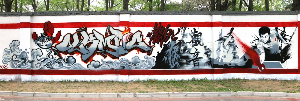
In Olympic Beijing we find a number of typically Chinese elements representing the country’s past and present greatness (calligraphic inscriptions, bamboo, pagodas, a table-tennis player, traditional cloud and wave motifs), with explicit references to the Beijing Olympics (the central lettering, the Olympic torch, the stylised little man logo and the Fuwa mascot), and all accentuated by extensive use of China’s hallmark red, recalling a modern-day nationalist propaganda poster.
Another important example of the Kwanyin Clan’s collaboration with the local government was the decoration of an ornamental tower in Guanyintang Art Avenue, a street entirely dedicated to art, opened in Beijing in 2008. The 20-metre-high tower was entirely covered in old school35Old school (laoxuexiao 老 学 校) – “Slang” term referring to the subcultures of a discipline or school and its past generations. It is used to compare the current state of a discipline, subculture or movement with a previous stage. In graffiti, it refers to the early years of graffiti writing in the United States (more specifically, the mid 70s to 1983), when numerous styles were invented, making the first writers famous. The expression “back in the day” also relates to this period. Also may refer to hip-hop music of this period. Old-school writers are given respect for being there when it all started, and specific writers are remembered for creating specific styles. For example, Blade and Comet created blockbusters, Phase 2 created bubble letters, clouds, Skeme’s “S”, and so on. freestyle graffiti created by the various members of the crew with brightly coloured lettering36Lettering – The style of the letters, and the pivotal concept of graffiti writing. Writers first and foremost paint letters, which may differ in size and style: block consists of large, square or rectangular letters, usually filled with one colour; soft consists of round, soft, cloud-like shaped letters, usually of one colour within an outline; in bubble style, the letters look like soap bubbles, very precisely coloured and with a wide outline; in wildstyle, the letters are composed of intersecting three-dimensional arrows, which give the idea of movement and confusion. In the case of Chinese graffiti art, since many writers also use characters in their pieces, a new term was coined to indicate the style of the characters: Charactering., making it the tallest graffiti in mainland China.
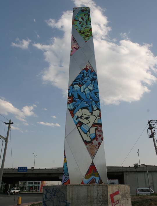
Besides legal activities, the Kwanyin Clan also engages in illegal street bombing in Beijing, but, as per Chinese customs, almost exclusively in specific areas where tolerance is higher, such as the 798 Art District and Sanlitun, the city’s most international district. Their first documented experience of illegal bombing was in April 2007, in the 798 Art District. This type of activity usually consists of tagging up and/or throwing up bubble letters using one or two colours.
More elaborate are the works created by the Kwanyin Clan on Beijing’s most important halls of fame near the Today Art Museum and the 798 Art District, and between the China-Japan Friendship Hospital and the Beijing Institute of Fashion Technology, alongside a street particularly popular among the crew which they have renamed The Kwanyin Street. On these walls, the Kwanyin Clan usually creates complex masterpieces37Masterpiece (dafu de zuopin 大幅的作品) – A piece of excellent quality, a particularly successful graffiti. composed of wildstyle lettering and charactering, enriched by numerous figurative and decorative elements and calligraphic inscriptions in different colours and styles.

In these works, the search for “Chineseness” is much more evident than in their commissioned or illegal works. Indeed, the crew’s primary objective is to create a style whose aesthetic manages to mediate between the identification of distinctly Chinese elements, construction, conception and artistic practice, and the adoption of an art form and technique borrowed from the West. This idea of blending is recurrent in their works, especially the ones rich in Chinese writing, calligraphy and traditional painting elements, or where there are strong references to classical symbolism (from dragons to pagodas, to yin and yang symbol) or to artistic forms that marked the history of China (from the ritual bronze vessels of the 2nd-1st millennium BC to Maoist propaganda posters).
Ink painting in urban form
The real driving force behind the crew’s artistic research is its leader, EricTin. What he seeks to do is pursue the search for a new aesthetic in which tradition makes modernity, starting from far-western media and art forms to create an identifiably Chinese style, strongly “sinificated”, yet aesthetically accessible on a global scale. “In our creative activity, we draw nourishment from Chinese painting […], and especially our large-format works are essentially based on the reuse of typically Chinese elements” (video Guanyin 观 音 2008). This is exemplified in one of the Kwanyin Clan first masterpieces, entitled Shanshui PIC 山 水 PIC38Guanyin tuya 2007 观音涂鸦 2007 [Kwanyin Graffiti 2007], video, 3’08’’, published on Tudou by EricTin on 28 February 2008: https://tv.sohu.com/v/dXMvNDkxNjMyMDkvMTc1NzA5MjEuc2h0bWw=.html (Landscape Painting PIC, Pic. 7). This enormous graffiti, measuring 42 m in length and about 2 m in height, was executed by the entire crew during China’s First Graffiti Exhibition – indeed, one of the first graffiti exhibitions held in Beijing – which took place at the International Exhibition Hall from 9 to 11 November 2007. The aim of the exhibition was to present graffiti art to the public through murals, paintings and themed installations. The four-day exhibition was part of the programme of the China International Cultural and Creative Industry Expo, which provided artists with a 300 m long hall of fame and other public spaces where they could create free-subject or Olympics-themed graffiti.


Regarding the title of the work, it is worth noting that the expression shanshui 山 水 , which translates as “landscape painting”, consists of two distinct characters: shan 山 , meaning “mountain”, and shui 水 , meaning “water”. In Chinese landscape paintings, mountains and rivers are essential elements as they represent the backbone of the entire composition. PIC is an abbreviation for piece39Piece (zuopin 作品) – A graffiti painting, short for Masterpiece. It is also considered an enlarged tag executed with spray cans, composed of multi- coloured letters (it’s generally agreed that a painting must have at least three colors to be considered a piece). The term is generally used to distinguish graffiti from simple tags. The piece is the third stage in the evolution of letters, after the tag and the throw-up., but is also easily confused with “picture” (image, drawing) (Valijakka 2015, p. 263). At first glance, the work might appear like a traditional ink landscape painting, characterised by mountains in the background and a watercourse in the foreground, lush vegetation on its banks, a thick mist surrounding the mountains, clusters of huts in the valleys, and fishing boats on the river waves. The layout of the piece is also reminiscent of the handscroll, and the colours recall those of monochrome ink painting, the highest form of Chinese painting, which only involves the use of black ink in all its nuances, and the natural colour of the paper roll to create works with a strong expressive power. The whiteness of the paper is used to render the water of streams, mist and clouds. This is one of the peculiar characteristics of this type of painting, which we find perfectly reproduced in this graffito: the black of the ink in various gradations (up to grey) and the whiteness of the paper in various shades (up to ochre).
EricTin stated:
Many features of Chinese classical culture can be transposed into contemporary graffiti […]. Just think about the arrangement of a composition: because of the horizontal support, the arrangement of a graffiti piece on a wall is very similar to traditional Chinese painting. The wall is like a scroll: once you transpose the traditional painting frameworks onto it, you will automatically have the feeling of being in front of a Chinese landscape painting. Moreover, we can use the typical colours of traditional Chinese painting (black, white, and grey) also for writing characters and letters. Consequently, the bottom colour tends to reproduce the texture of “rice paper”40Rice paper (xuanzhi 宣纸) is used in traditional Chinese painting as canvas.. (See Video section, Guanyin 观音 2008).
When we were shaping Shanshui PIC – EricTin adds – we wanted to reproduce the arrangement of Song Dynasty landscape paintings. Chinese landscape painting reached its peak in the Song Dynasty (960-1279) […]. Personally, I do like landscape paintings of that period, so in Shanshui PIC we tried to use a similar ink technique. (Interview, 2016)
The spray-painting technique used here by the Kwanyin Clan indeed mirrors the cunfa 皴法 (wrinkle method), a Chinese ink painting technique normally used for the surface of rocks and mountain reliefs. It is based on particular brush strokes applied in subsequent stages:
- “outline” (gou 勾);
- “texture” (cun 皴), e.g., the veins created by the brush within the outline to “wrinkle” the stones;
- “rub” (ca 擦), which consist of spreading ink with a dry brush to accentuate the rough texture of rock surfaces, logs and mountain slopes;
- “render” (ran 染), e.g., applying colour to the landscape with light ink;
- “dot” (dian 点 ), e.g., the tracing of dots to represent the vegetation in the background and the musk on the trees (Illouz 1989, pp. 104-113).
While using spray cans instead of brushes, the Kwanyin Clan adopts a similar methodology in this work, where it:
- transfers the sketch41Sketch (shougao 手 稿) – The draft of the piece. Usually, every writer has a sketchbook in which they practice before painting on walls. outlines to the panel;
- fills in the outlines with different colours42Fill-in (tianse 填色) – A painted area within the letters on a piece or throw-up.;
- uses different caps43Cap (pentou 喷头) – The cap of the spray can (penqi guan 喷漆罐) is the interchangable spray-can nozzles fitted to the can to vary the width of spray. Its dimension may vary: fat, for large and quick spraying of backgrounds and thick lines; superfat, for ultra quick strokes and large surfaces; soft, or medium-sized, halfway between fat and skinny, for soft, versatile strokes perfect for backgrounds and edgings; skinny, for outlines; superskinny, for precision work and ultra-thin lines. to vary thicknesses and effects;
- draws final outlines (after filling in, to further define the lettering);
- adds dripping and “dotting” effects to the piece.
The method used to give depth to the piece is also taken from the classical tradition: this is the “three distances” (sanyuan 三元) methodology, devised by the famous Song dynasty painter Guo Xi (1020-1090) to create the illusion of depth in Chinese landscape painting.
If we look more closely at the work Shanshui PIC (Pic. 7), we will also notice two calligraphies. They are yet another obvious reference to traditional Chinese aesthetics, according to which calligraphic inscriptions are a requisite for the embellishment of landscape paintings. The first calligraphy is placed at the centre of the work and consists of two macro-characters Guan Yin 觀 音, the name of the crew, written in regular script (kaishu), which is the most intelligible of the five fundamental styles of Chinese calligraphic art. As per traditional calligraphy, the characters are written vertically and the variation in the thickness of the strokes determined by the different brush pressure applied on the paper is here achieved through the skilful use of spray paint. We have the illusion of being in front of a genuine traditional calligraphy. What is not traditional is the presence of the names of the crew members, written horizontally and in Latin letters at the bottom: on the left, Quan, EricTin, Yumi, Apart, Jer, Nato, Scar and, on the right, Joey, Keno, Pluto, Viga, Ctn, Kwanyin.
The simultaneous use of Latin letters and Chinese characters is a recurring motif in the Kwanyin Clan works and embodies the blend of elements from China (vertically written characters) and the West (horizontally written Latin letters), both traditional (use of calligraphy) and modern (tags of the crew members).
The second inscription, on the upper left-hand corner, is a long calligraphy written in a highly stenographic cursive style (caoshu 草书), in which the strokes of the characters are merged sometimes, impairing their recognisability. It is written in vertical columns to be read from right to left and from top to bottom, as is customary in classical Chinese, and is embellished by a pronounced dripping effect, which seems to simulate ink drippings on paper. According to EricTin’s statement (interview, 2016), the content of the calligraphy was inspired by a poem by Teng Zijing (990-1047), a famous Song dynasty poet, entitled Immortals on the Riverbank (Lin jiang xian 临江仙). In the poem, Teng Zijing describes the enchanting landscape surrounding Dongting Lake (near the city of Yueyang, South China’s Hunan Province) on a foggy autumn morning and evokes a deep melancholy atmosphere, recalling the ancient legend of the gods of the Xiang River (E Huang and Nü Ying, the two wives of the mythical emperor Shun, died of grief at the death of their husband). Legend has it that the emperor Shun (2294-2194 BC) travelled to a village near Shunyuan Peak (in the Jiuling mountains in Hunan) to fight a dangerous snake and set the village free. Unfortunately, the snake bit him to death near the Xiang River. His two wives, E Huang and Nü Ying, daughters of the first emperor Yao, set out to find their husband. When they arrived where he had been killed, being unable to find his body, they were consumed by grief: dying, they turned into two mountain peaks (Ehuang Peak and Nüying Peak). For this reason, the two women have been remembered ever since as “The Ladies of the Xiang” or “The Gods of the Xiang River”.
Teng Zijing’s poem referring to this episode reads as follows:
Lake water embraces the sky,
Glows brightly in crystal autumn.
Jun mount is a piece of paradise
And a mist from the Yun and Meng Marshes
Has beleaguered the city of Yueyang.
Xiang River Goddesses play the lute
Ancient memories sad hearts lacerate
Orchid’s whispering delicately scented
No one can be found whence the melodies
ended On upper river verdant peaks silently
stand.
The use of a “poem” (shi 诗 ) as the content of a “calligraphy” (shu 书 ) to enhance the depiction of a “painting” (hua 画 ) suggests the so-called “three perfections” (san jue 三绝): the indissoluble artistic trinity of poetry, calligraphy and painting (shi shu hua 诗书画) that every literate and erudite person had to be able to practise and master in imperial China and that was often employed within the same artwork, making it a true masterpiece (Sullivan 1980). The choice of poetry is not accidental. EricTin stated:
First, I thought of including a poem from the Song dynasty that consisted of a description of a landscape, and then I chose Immortals on the Riverbank because it expressed both of the concepts I wanted to convey, namely the description of a landscape and the sense of desolation and loneliness after a joyful encounter. This is also what happens with graffiti art works: they are short-lived and all that remains are photographs saved in one’s computer. Few people are lucky enough to see the original works. (Interview, 2016)
In Shanshui PIC, innovative elements with respect to this traditional layout are the large tags of the six members of the crew (Yumi, EricTin, Quan, Scar, Jer, Viga), which stand out among the mountains and have been transcribed through an accentuated use of 3D style and wildstyle44Wildstyle (kuangye fengge 狂野风格) – A complex composition of letters assembled to give a unique shape and dynamic to the piece. In this style, the letters are distorted and superimposed, and sometimes enriched with three- dimensional arrows, tribals, pikes, puppets and other decorative elements that give an idea of movement and confusion. This style can be straight or soft: the first is symmetrical, and the arrows forming the letters draw sharp angles; the second is asymmetrical, and the angles are replaced by curved arrows with rounded points. To increase the perception of depth, in addition to inserting junctions between characters, the entire word structure can be turned into a three-dimensional element. This complicated construction of interlocking letters is considered one of the hardest styles to master and the lettering of the pieces done in wildstyle is often completely undecipherable to non-writers., and the enormous live motion figure of a graffiti writer portrayed in three different poses between the two calligraphies. He is creating a piece before him, and represents the alter ego of the crew members and of any graffiti writer. In fact: he is wearing hip-hop urban clothing (a pair of large pants, big hoodie, cap, and sneakers); he holds a spray can in his right hand, which represents his “artistic weapon”; and his movements resemble those of a b-boy (break-dancer). He is the connection between the entire piece and American hip-hop45Hip-hop (xiha 嘻哈) – A cultural movement that emerged predominantly in the Afro-American and Latino communities of the Bronx in New York, in the late 1970s. The four main aspects or elements of hip-hop culture are speech, music, movement and sign: MCing (shuochang 说 唱), or rap music introduced by Afro- Americans (MC is the acronym of Master of Ceremony); Djing (dadie 打 碟), introduced by Jamaicans; graffiti writing (tuya shuxie 涂鸦书写) and breakdance (diban wu 地板舞 o pili wu 霹雳舞), introduced by Puerto Ricans. culture, of which graffiti is an important part. At the same time, he can be compared to a modern-day calligrapher, who, instead of “dancing with the brush while the traces of ink record his movement”46Interview with Qui Zhijie by Walter Romeo: “The calligrapher is, in fact, like a dancer dancing with his brush, while the ink stroke records his movement” in Qiu Zhijie at work, Youtube video uploaded by Walter Romeo on 31 May 2008, https:// www.youtube.com/watch?v=Dtdbt4e68LM (last accessed in February 2024)., dances with his spray can, while the paint records his action on a hall of fame.
Thus, by mixing traditional and modern elements, in Shanshui PIC the Kwanyin Clan has successfully created what can be described as a Chinese landscape painting in the form of contemporary graffiti.
Bamboo painting and graffiti writing
The piece entitled New Style (Pic. 6) relates to bamboo painting (zhuhua 竹 画 ), a type of art that has always played a leading role in China, being second only to landscape painting.
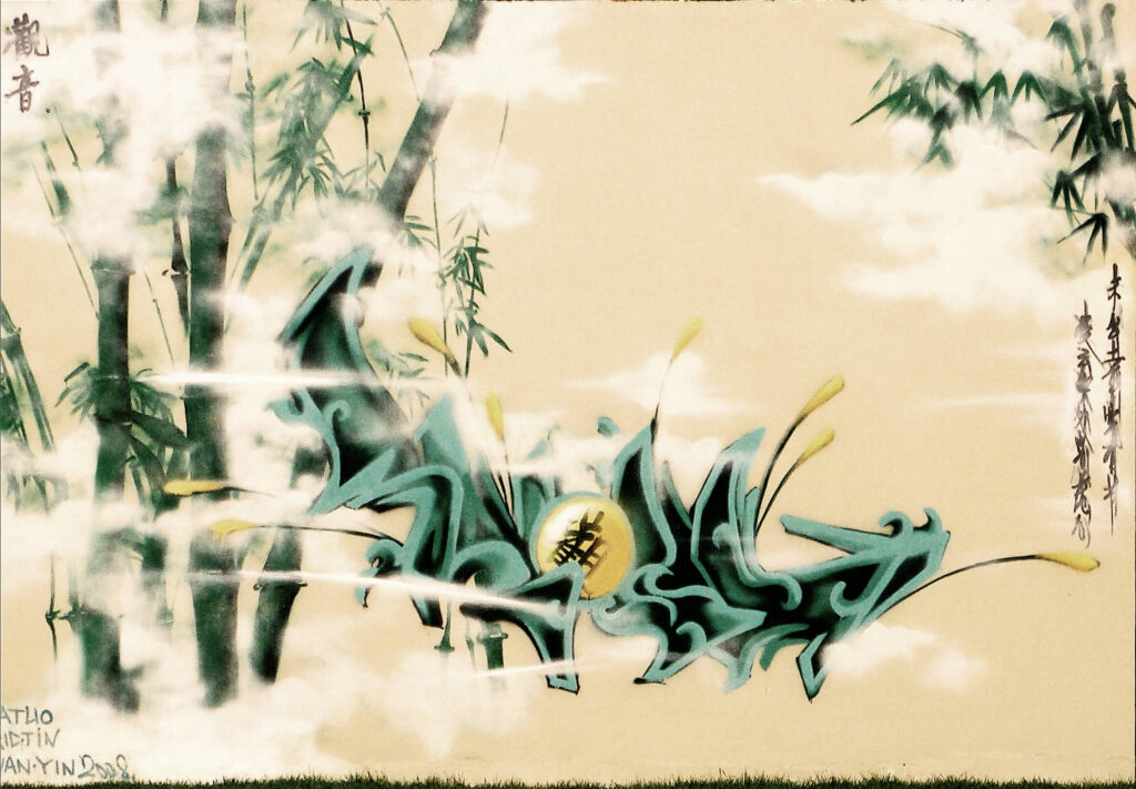
In painting bamboos, which represent the scenic backdrop of the work, EricTin and Natuo, the authors of the piece, were strongly influenced by traditional canons that tend to emphasise “the lithe grace of its stalk and the dashing sword-point of its leaves” (Sullivan 1967, p. 215). The bamboos do not, however, constitute the core of the composition, as one would expect, but are replaced in their pre-eminent function by a lettering piece placed at the centre. Still, there is a significant correspondence between the lettering piece and the bamboos in the background: the shades of green used for the lettering are the same as the bamboos; the four interlocking letters KYGS (the acronym for KwanYin Graffiti Studio) are reproduced through extreme (almost indecipherable) wildstyle and numerous 3D effects, with the sole intention of reproducing the knottiness of the bamboos; the sphere has the same colours as the thin stems sprouting from the letters, resembling the stylised foliage of the bamboos immersed in a thick mist.
The colours and the angularity of the central writing also recall the greenish patina and the typical protruding and richly worked surface of ancient Chinese ritual bronze vessels, which, as EricTin explains in his blog, are the real source of inspiration for the piece. The presence of mist is another reference to traditional Chinese painting, but here it is painted in the colour white instead of being rendered through the whiteness of the background. The format of the work, reminiscent of both Chinese handscroll papers47The main formats of Chinese paintings are hanging scrolls, handscrolls, fans and albums. and big western canvases, and the use of both letters and characters, represent points of contact between the Chinese and western traditions. In fact, in the bottom left-hand corner, the name of the two authors (EricTin and NaTuo) and of the crew (Kwanyin) are written horizontally in Latin letters; while vertical Chinese characters are used in the top left-hand corner for the group’s tag (Guanyin 觀 音 ), inside the yellow sphere at the centre (Guan 觀), and finally on the right edge in the calligraphic inscription.
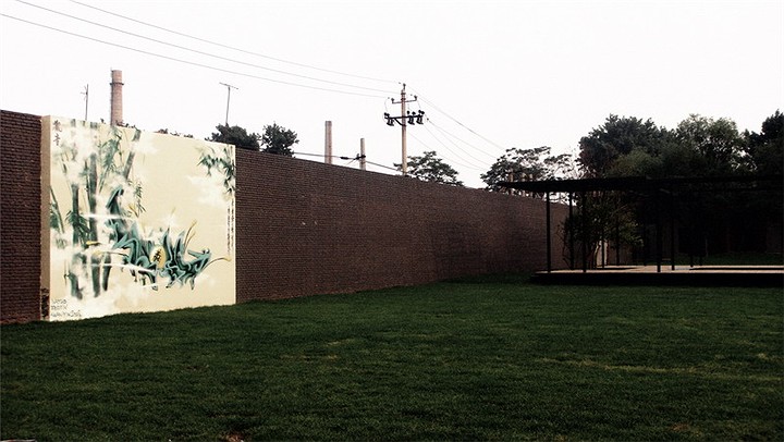
The latter is written in cursive style (caoshu) on the right side of the work and displayed in two vertical columns to be read from right to left and from top to bottom, like the calligraphy of the previous work. The content is a couplet entitled The Bamboo (Zhu 竹 ) composed by Zheng Xie (1693-1765), a famous Qing dynasty (1644-1911) poet, painter and calligrapher who was particularly skilled at drawing bamboos combining painting and calligraphy.
The couplet reads:
Buried in the earth it already has a culm,
reaching into the sky it is still open-minded.48The couplet reads: Wei chutu qian xian you jie 未出土前先有节 / lingyun shenchu zong xuxin 凌云深处总虚心.
The short poem is a hymn to the qualities of the perfect gentleman (junzi 君子), of whom the bamboo has always been the personification. Themodesty, honesty, uprightness and open-mindedness of the perfect Chinese gentleman are expressed by the straightness, flexibility and malleability of bamboo, its ability to resist the elements, bend and never break, and its “hollow structure” (xu xin 虚心, lit. empty heart). In the Chinese philosophical meaning, such hollowness is the absence of ties and desires, and thus indicates inner peace and humility; the readiness of mind needed to understand the world, without constraint and according to the principle of spontaneity (Illouz 1989, p. 57). The purpose of using Zheng Xie’s poem is to create an ideal connection between the ancient Chinese literati – the perfect gentlemen – and contemporary graffiti writers, here represented by the members of the Kwanyin Clan.
“Divine” charactering
Alongside its references to traditional Chinese painting, the Kwanyin Clan was one of the first Chinese crews to experiment with the use of Chinese characters instead of Latin letters in its artistic creations. In this sense, the most emblematic work is Shengong yijiang 神工意匠 (Ars divina, 2010, Pic. 8).

In the words of EricTin, author of the piece:
Shengong yijiang was created in 2010, when I started experimenting with the use of Chinese characters as the main element in writing pieces. Until then, most of the styles I had employed belonged to the so-called old school and involved extensive use of English. Shengong yijiang was my first successful attempt at a systematic study of the use of Chinese language in graffiti. (Interview, 2015)
The piece clearly follows the European, and more precisely the German, style and use of colour: there is a slight tendency towards wildstyle where the characters are still readable, and a significant use of 3D. The fill-in colours are very simple yet embellished with geometric decorative inlays. The first outline and the thickness of each character are black, the second double outline is red with glow effects, and the final fragmented outline49Outline (lunkuoxian 轮廓线) – The letter outline, the contour line of the piece that defines and shapes its structure: the outline put on the wall and then filled, or the final outline done around the piece to finish it. Can also refer to the drawing done in a piece book (see Black book) in preparation for doing the actual piece (see Sketch). is yellow. The yellow lines suggest the spiral movement of the clouds in the background, which reproduces the yunwen (clouds pattern), a Chinese traditional decorative pattern to which the artist added stylised drips. A dark grey shadow contours the writing and creates a three-dimensional effect through a technique that recalls chiaroscuro. Thus, from a stylistic point of view, this work perfectly imitates the Euro-American graffiti manner, while its composition reproduces the structure of “big character calligraphy” (dazi shufa 大字书法) written on traditional Chinese horizontal handscrolls. This structure is usually composed of a large calligraphy in the middle, a poetic inscription on the right, a colophon on the left, and the artist’s red seals as signatures (Li 2009, 158-71). Shengong yijiang has the same layout: a large Chinese character piece stands out in the centre, with a calligraphic inscription of poetic content on the right, the name of the crew written vertically on the left, and the signatures of the author (EricTin) and the crew tagged all around the central writing.
The four characters in the middle, Shen gong yi jiang 神工意匠50The chengyu was confirmed by EricTin on the web forum Graffiti – Hip Hop (Tuya ba 涂鸦吧): Kwanyin_Tin (2010), Guanyin Kwanyin Clan Tin geng xin ‘shengongyijiang’ gengxin tupian 观音 Kwanyin Clan Tin 更新”神工意匠” 更新图片 (The new piece by Kwanyin Clan member Tin, Shengong yijiang, new pictures), Graffiti – Hip-Hop Web Forum, 19 June, http://tieba.baidu.com/p/803633468 (last accessed in February 2024)., are the main point of interest of the whole composition and give the title to the work. They form a so-called chengyu51EricTin affirmed that the use of chengyu is a feature of Kwanyin Clan pieces (interview by M. Merenda, 4 November 2015)., which is a prefixed idiomatic expression composed of four characters and generally originating from ancient quotes, mottos and proverbs, frequently used in modern Chinese to concisely convey broader concepts of any nature. This chengyu describes the sublime beauty of works of art (e.g., architectural buildings, paintings, etc.) that cannot (only) be created by human capacities and labour. It reproduces the last verse of a poem by Zhao Puchu (1907-2000), a well-known social activist, Chinese Buddhist leader, and distinguished thinker and calligrapher. The poem is entitled The Byodo-in Temple (Pingdeng yuan 平等院), a famous Buddhist temple established in 1052 in the Kyoto Prefecture (Japan). In this poem, Zhao Puchu describes the ecstatic sensation derived by contemplating the sublime beauty of the main pavilion of the temple. According to the author, such excellence cannot merely be the result of human ability but must have been inspired and surrounded by the divine breath. The poem reads:
Gasp in awe,
Like never before,
In front of the Phoenix Hall,
One look
And I am back to a thousand years ago.
Buddhism
Alone
Equates the Tang’s glow,
And passes on
The sublime beauty of the divine (shengongyijiang).
Another key element of the piece is the calligraphic inscription in the top-right corner. At first sight, it seems a traditional calligraphy written in the running or semi-cursive style (xingshu), but it was not created using the classic tools of Chinese calligraphy: the writers employed spray cans instead of brushes; the ink is replaced by black spray paint; the support is a white wall, instead of paper. The text quoted in the calligraphy is the second stanza of the ancient poem Rouged lips (Dian jiangchun 点绛唇). It was composed by Wang Yucheng (954-1001), a famous scholar of the Song Dynasty, during one of his exiles in the South of the Empire, after being dismissed from his government position due to strong criticism against the policies of the time. In the poem, he expresses his sadness and despair, with nature becoming the mirror and voice of his deepest feelings: empathy with nature, pain for the unjust exile, pervasive loneliness and idyllic scenes are the central themes of the poem. These are recurrent themes in China’s lyric poetry of all times, and through this work they are revived in a fragment of contemporary urban art. The poem reads as follows:
Laden with frowning cloud and steeped in tearful rain,
The southern shores still beautiful remain.
In riverside village flanked with fishermen’s fair,
A lonely wreath of slender smoke wafts in thE
air.
Afar a row of wild geese fly,
Weaving a letter in the sky.
What have I done in days gone by?
Gazing from the balustrade,
Could I weave my way as far as they?52Translated according to the annotated Chinese text found in Chen 1988, pp. 290- 291, and the paraphrase of the poem in modern Chinese in Li Jing, 2009, p. 210.
The two poems (The Byodo-in Temple and Rouged Lips) have opposite functions: the first is to create a parallel between graffiti art and the other forms of art pervaded by the “divine breath”; the second is to narrate the loneliness and sadness that the artist himself is experiencing, as the crew will shortly afterwards begin to split up.
In addition to the use of poems, Chinese characters and calligraphy, a red decorative motif in the bottom-right corner also makes reference to traditional Chinese models. Its outline recalls the swirling and sinuous “turbulent ocean waves” (ping shui 平 水 ) that usually decorated the hem of imperial court robes of the Qing dynasty, while the web of lines within evokes the motif of “vertical waters” (li shui 立水), rising from the deep sea right beneath the waves, composed of zigzagging coloured strips that started from the hemline of the robe. Moreover, the obsessive repetition of tags has the main purpose of balancing Chinese traditional aesthetics with western graffiti culture. With its five different tags, EricTin’s work fits perfectly in the Euro-American graffiti writing53Graffiti writing (tuya shuxie 涂鸦书写) – A worldwide social, cultural and artistic phenomenon born in the 1970s in New York ghettos as a spontaneous expression, with no declared intent, of a heterogeneous group of young people belonging to the hip-hop subculture. The etymology of the word graffito derives from the Latin gràphium, or “style of engraving”, which in turn stems from the Greek gràphein (γράφειν, to scratch, to hollow, to draw). The English term “writing”, instead, stands for the act of creating one’s tag in public spaces using spray paint or markers. It entails a study of lettering, namely the style of the characters that make up both simple tags and pieces. In China, the term “graffiti” does not only refer to the writing of letters or characters as in writing, and thus graffiti is also called tuya yishu 涂 鸦 艺 术 (lit. graffiti art), implying a wide range of artistic expressions on public soil (making it much closer to street art). Another term used is tuya huihua 涂 鸦 绘 画 (lit. graffiti painting), which refers to graffiti containing puppets. tradition, of which the obsessive repetition of tags is a hallmark (Mininno 2008, p. 10). But in writing these tags (three in letters and two in characters), EricTin counterbalances the use of different forms of writing with the aim of balancing the two hemispheres: the three letters of the “TIN” tag are intermingled with Chinese characters, thus creating a visual fusion of Chinese and western cultures.
Graffiti for sports
Between 4 and 6 February 2008, EricTin, Nat, Yumi and Quan reunited at the Nike 706 Art Space in the 798 Art District to work on a Nike- commissioned piece entitled Shirupozhu 势如破竹 (With Irresistible Force, 2008, Pic. 9).
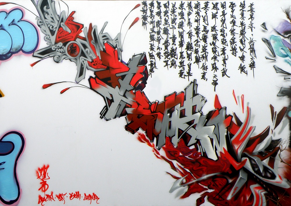
The Nike 706 Art Space was established by Nike China in January 2007 in the 706 plant of the former industrial complex of District 798, with the aim of fostering creativity, sport and self-expression.
Marked by extensive use of charactering and Chinese calligraphy, the piece created by the Kwanyin Clan is part of a major project entitled the Lebron Experience Center, sponsored by Nike China to promote the game of basketball in the country through outstanding American basketball figures. The project consisted in turning Nike 706 into a modern interactive basketball court where the brand’s latest products could be displayed, and videos of the famous American basketball player LeBron James, represented by a 3D hologram, could be shown. In these video projections, the athlete described his six signature moves (dunk, steal, post-up, pass, fade away and drive), explaining how they had helped him become a champion.
For the opening ceremony of the Lebron Six Experiences event, a huge hall of fame was mounted on the external wall of the art space to host six graffiti pieces. Each piece was created by a famous Chinese crew – Xianggang Fengwei, FLB crew, Kwanyin Clan, ABS crew, Beijing Penzi and NGC crew – and had one of Lebron’s six signature moves as its main subject.
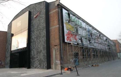
The subject of the Kwanyin Clan piece was the post-up, in Chinese tupo 突破. Since the primary meaning of tupo is “to make a breakthrough, break through a defence”, the Kwanyin Clan chose the expression Shirupozhu 势如破竹 (With Irresistible Force) as the title of their work. The central piece of this graffiti is composed of the four characters of the chengyu, written in an extreme wildstyle that makes them almost indiscernible.
Among the characters, the tag “Natuo” creates an interesting interpolation between opposite writing systems. The characters are also surrounded by other rather extreme wildstyle pieces, probably made by EricTin (top) and Yumi (bottom). As EricTin explained (interview, 2015), the chengyu included in his works are not causal: they transcend their literal meaning, they tell stories. In this case, the expression Shirupozhu tells the story of one of the most glorious generals of the Chinese army, Du Yu (222-285). In 280 he succeeded in reuniting the empire and pronounced this expression, which literally means “with enough force to split bamboo”, to encourage his troops during the crucial battle before reunification. His speech produced the desired effect. Using this chengyu, the Kwanyin Clan thus wants to connect Du Yu’s story with LeBron’s. In their different ways, both succeeded in “breaking through” due to their overwhelming force.
Another reference to battles and to the tenacious stubbornness of soldiers is the long calligraphy on the upper right, written in xingcao 行 草 style, halfway between the semi-cursive and the cursive style, in vertical columns displayed traditionally, from right to left. According to EricTin, the content of this calligraphy is inspired by the poem Full River Red (Man jiang hong 满 江 红 ) composed by the General Yue Fei (1103-1142), who wrote it during one of the last battles against the northern barbarians, before the final withdrawal of his imperial army. In the poem, Yue Fei expresses his anger and wrath towards the enemy, as well as his regret for the emperor’s decision to withdraw his troops on the verge of reconquering lost lands:
My hair bristles in my helmet.
Standing by the balcony as the rain shower
stops, I look up to the sky and loudly let Heaven
know The strength of my passions.
My accomplishments over thirty years are mere dust.
I travelled eight thousand li with the clouds and the moon
Never taking time to rest,
For a young man’s hair grows white from despair.
The humiliation of the Jingkang period
Has not yet been wiped away.
The indignation I feel as subject
Has not yet been allayed.
Let me drive off in a chariot
To destroy their base at Helan Mountain.
My ambition as a warrior
Is to satisfy my hunger with the flesh of the barbarians,
Then, while enjoying a rest,
Slake my thirst with the blood of the tribesmen.
Give me the chance to try again
To recover our mountains and
rivers Then report to the emperor.
(Translated by E.A. Buckley 1993, pp. 169-70)
The connection between the poem and the theme of the work is clear: the attitude of a basketball player in a post-up position, trying to shoot the hoop while contrasting the opponent, is as combative as that of Yue Fei, determined to face his enemies, shield the territories he has reconquered with his army, and continue his advance as far as ultimate victory. The choice of colours (black, white and red) recalls the white paper and the black ink of traditional Chinese calligraphy, with its different shades of grey, and the bright red of the seals creates a contrast of tones that balances the entire composition. In this case, red is used both to display the tags of the crew and the writers in the left corner of the work (guanyin 观 音 vertically and Erictin/Nat/Yumi/Quan Er horizontally) and to recall the title of the poem (Full River Red) and its content: the tumultuous battles and the meaning of the four-character chengyu that stands at the core of the entire work. The red flames at the bottom of the writing, from which the whole piece seems to arise, emphasise the fierce atmosphere of the battle.
In this piece, the Kwanyin Clan created genuine cohesion between form and content: the upheaval of the battle and the burning passion expressed in the chengyu and in the poem are equally evoked by the rapid and passionate style of the calligraphy at the top, the use of the colour red, and the same style used in the colophon at the bottom, as well as by the blazing flames and the impenetrable entanglement of wildstyle characters. White, black and red are also the colours of the basketball court in Nike 706 and of the Nike clothing worn by LeBron in the videos54Nike 706 Centre Lebron 6 Experience, Bēhance, 4 July 2010: https://www.behance.net/gallery/565889/Nike-Lebron6-Interactive-Basketball-Training-Centre (last accessed in February 2024).. The colours, shapes and contents of the graffiti thus transport us into a new battlefield, one of new heroes and products breaking into the Chinese market and society.
Collaborating with commercial brands like Nike is not uncommon for the Kwanyin Clan and, indeed, for most Chinese crews, who, as we have seen previously, consider it as a way to financially support their work. Although it may seem contrary to the spirit of rebellion and denunciation that characterised graffiti culture from its very beginnings, it should not be forgotten that this phenomenon is framed within the Chinese context, where graffiti art is part of the artistic sector and the “art market”, and thus not a mere form of youthful expression and rebellion. Moreover, the Kwanyin Clan started out as a “graffiti studio” (tuya yishu de bangongshi 涂鸦艺术的办公室). Their headquarters used to be a bus completely covered in graffiti, parked in the 798 Art District. This functioned as a workshop, where they created not only graffiti but also graphic/digital design works, a type of art specifically designed to be commercialised.

The crew has produced numerous posters55Poster art (haibao 海 报) – A form of street art created by joining sheets of printed paper together to compose a large advertising-style image that can even fill entire building facades. to promote hip-hop, breakdancing and graffiti events. Since 2006, they have been merchandising their custom-made T-shirts with writers’ caricatures, Chinese characters and restyled majong tiles, and in 2007 they designed the cover of a Mongolian hip-hop music compilation. Even in these graphic works, the Kwanyin Clan often incorporates traditional Chinese elements (e.g., pagodas, Chinese unicorns or qilin and Taoist deities) and makes use of Chinese writing and calligraphy, always striving for an overt “Chineseness”.
With regard to graffiti works, the crew engaged in frequent commercial collaborations, especially with sports (Kappa, Lotto and Nike) or electronics brands (Nokia, Dell and HP) and with private clubs (VICS, master club, KTV, gaga club, underground club and golf club). In these cases, their pieces were usually made on removable panels (once even on paper boxes, for iMART in 2008)56Nike 706 Centre Lebron 6 Experience, Bēhance, 4 July 2010: https://www.behance.net/gallery/565889/Nike-Lebron6-Interactive-Basketball-Training-Centre (last accessed in February 2024). or indoor walls (of clubs or shops) using Latin letters57The exceptions are Shirupozhu, the first charactering piece of this kind according to EricTin (interview, 2016), and the graffiti made in November for the New Silk Bay Media (Xin si wan chuamei 新丝湾传媒) on the internal walls of its headquarters in Beijing. and old school Euro-Americans styles. These works are usually composed of a central writing piece of the name of the brand/club or the crew/writer who created it, often combined with amusing puppets.
Apart from Shirupozhu, the crew’s most successful experiment with distinctly Chinese yet modernised elements in a work commissioned by a foreign brand was The Entire World Celebrates (Putian tong qing 普天同庆, Pic. 10).
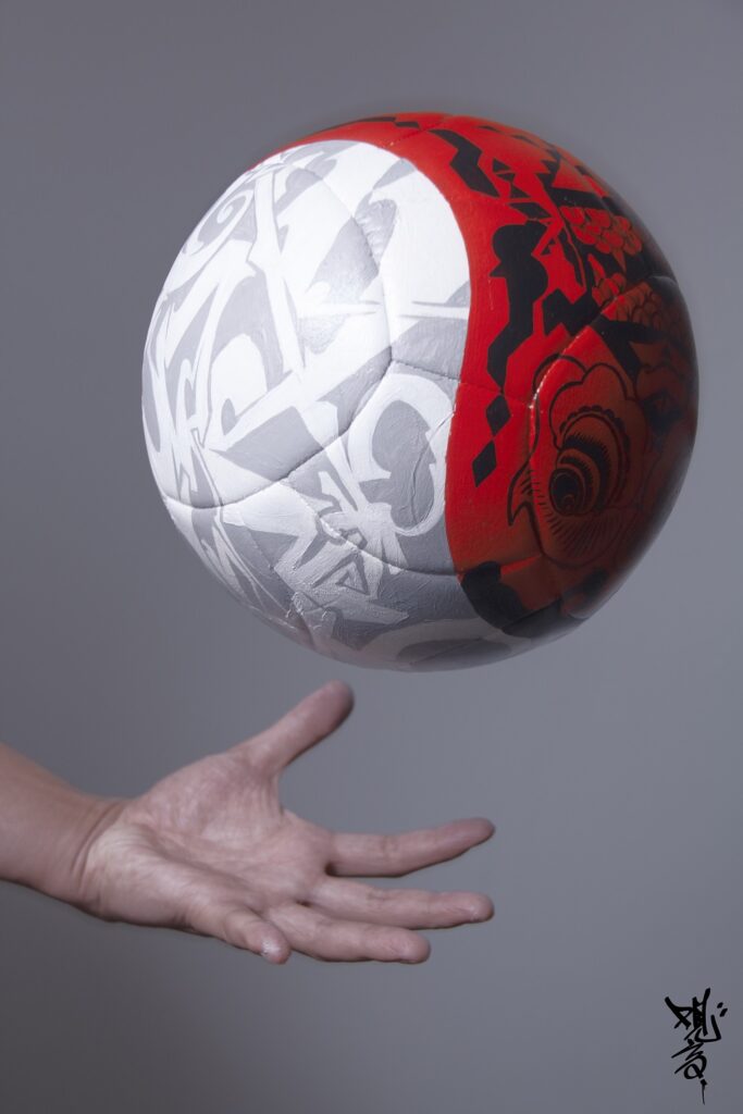
It depicts a football fully hand-painted with tempera and marker, made on commission for Adidas for the 2010 FIFA World Cup advertising campaign. Yumi and Nat, the creators of the piece, covered the entire surface of the ball with traditional Chinese motifs, reworked in very personal ways. A curved line divides the ball into two parts and recreates the Taijitu 太极图, the Taoist symbol par excellence, consisting of the stylised shape of a black and a white fish, intertwining in a whirling embrace. It represents the concept of the Tao (Dao 道 ), the source of being that regulates the development of the universe through the alternation of two complementary elements: yin 阴, the dark-negative polarity represented by the black fish, and yang 阳, the light-positive polarity represented by the white fish.
The two sections of the ball are filled with opposing motifs: one recalls the Euro-American graffiti tradition and the other the traditional Chinese culture, and these intertwine just like Yin and Yang, in a perfect fusion. On one side, Yumi creates an extreme grey and white wildstyle, while on the other, on a red background, Nat draws the zoomorphic image of the taotie 饕 餮 , an archaic decorative motif typical of ritual bronzes from the Shang (c. 1600-1046 BC) and Zhou (1046-221 BC) dynasties, representing a frontal, symmetrical mask with various parts of different animals.
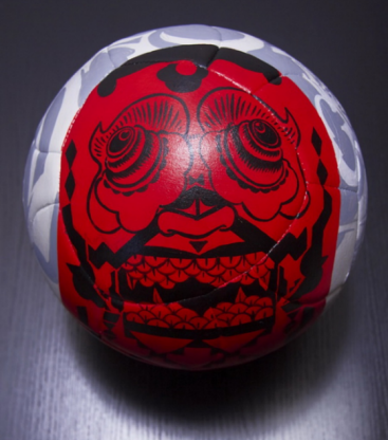
In the words of EricTin:
Since, in the Chinese tradition, football – or cuju 蹴 鞠 – evoked a Zen meditative act, we instinctively thought of the image of the Taijitu, consisting of the stylised form of two fish, one white and one black, intertwining with each other, surrounded by the Eight Trigrams. This design formed the basis of the work, to which we then added the zoomorphic image of the taotie, which is a traditional Chinese decorative motif I am particularly fond of. (Interview, 2016)
Interestingly, this work is intended to recall the ancient Chinese game of football, cuju (lit. kicking a leather ball). According to FIFA, cuju is the earliest attested form of football in the world, and its invention dates from the Han dynasty (206 BC-220 AD). Initially, it was slightly different from the modern game: there were six holes on each side of the pitch with six goalkeepers, and each team, composed of six players plus the goalkeepers, had to score the highest number of goals. In the Tang dynasty, the holes turned into two goals on opposite sides of the field and the game resembled the current one. The Eight Trigrams mentioned by EricTin in the interview are figures composed of three parallel lines, surrounding the Taijitu with a perfect octagon, each aligned to a cardinal point. The lines can be continuous or broken, indicating positive (yang) or negative (yin) polarity respectively. Each trigram corresponds to a natural element or phenomenon (sky, swamp, fire, thunder, wind, water, mountain and earth), and all together they symbolise the contents of the Book of Changes (Yijing), one of the fundamental texts of traditional Chinese knowledge. The wildstyle within one of the two sections of the ball recalls the linearity of the trigrams. Reference to the World Cup in the image is evident: the two sections of the Taijitu ideally represent the two football teams (the yin and the yang) that share and mix on the same pitch (the circle), thus generating a continuous action (the Tao).
Porcelain, marker and spray
A further occasion in which the Kwanyin Clan experiments with the use of innovative media is the series dedicated to blue and white porcelain realised between 2009 and 2010 (Pic. 11). The crew transposes graffiti art styles and techniques onto artefacts of diverse and extremely unique shapes (plates, vases and brush pots) through traditional cobalt blue decorations. In these works, the Kwanyin Clan creates a modern version of the iconic blue and white Chinese porcelain, combining a traditional type of art with contemporary writing techniques.
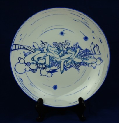
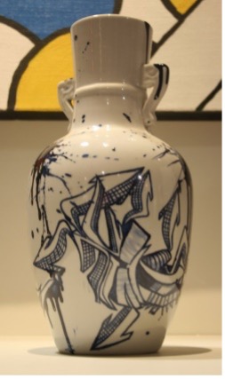
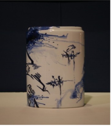
For instance, in the piece Heqi 和气 (Peace, Pic. 11), Nat used a blue marker to write, in wildstyle, the two characters of the title on a white porcelain plate, with arrows and zigzagging lines that perfectly combine a traditional approach with contemporary execution.
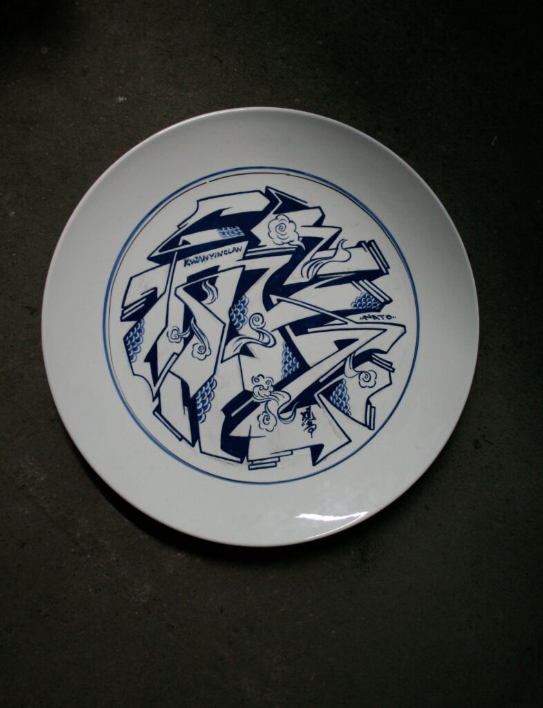
EricTin explains:
For us, using Chinese characters in graffiti form as decorative motifs for porcelain artefacts means experimenting with new patterns of decoration. Since the motifs used in porcelain are rather standardised and most of them are not compatible with today’s aesthetic models, we tried to create new ones. It was simply a matter of changing the support material for the writing piece: resorting to porcelain added a further oriental and traditional touch to our style, which, however, remains unchanged. In this specific case, the choice of the Heqi 和气 characters stemmed from the fact that decorative motifs in Chinese artistic handicrafts are always linked to auspicious and good luck messages, so we chose to focus the piece on these two characters. Indeed, they are indeed present in a chengyu used as a wish of happiness, which reads Heqi shengcai 和气生财 (Amiability begets riches). (Interview, 2016)
The Chinese elements in this work are numerous: blue and white porcelain, Chinese characters, the chengyu inspiration for the title, its auspicious meaning, the decorative “clouds pattern” (yunwen), and the motif of the “turbulent ocean waves” (ping shui) within the central part, all transposed in a modern key. This series is one of the preeminent examples of the Kwanyin Clan experimental power expressed by reworking traditional patterns.
The reference to porcelain, an art for which China has been renowned worldwide for centuries, can also be found in the work created by the crew in 2016 (Pic. 12) for the exhibition Art from the Streets (The History of Street Art – from New York to Beijing) held in the spaces of the CAFA Art Museum in Beijing (1 July – 24 August 2016). The exhibition was the first opportunity to showcase pieces by foreign street artists in China, generating both a geographical and temporal comparison of the street art phenomenon in its globality (Danysz 2016). The Kwanyin Clan was one of the few Chinese crews invited to participate in the event, proving the group’s fundamental importance within the art scene in mainland China and abroad.
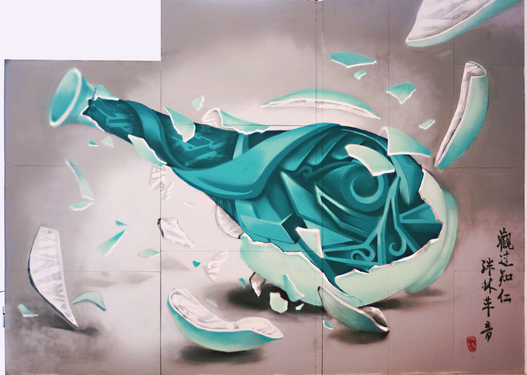
The work they produced for the occasion fits perfectly into their framework of research. The core of the composition is a green celadon glazed ceramic vase. This recalls the Jun-type celadons made in China during the Song Dynasty, considered one of the finest forms of Chinese art. The explosive force of the elaborate wildstyle lettering pushes onto the thin walls of the vase and disintegrates it, representing the forces of modernity that break and overcomes tradition. In the lower right-hand corner, the usual semi-cursive style calligraphic inscription consisting of two chengyu on vertical columns serves as a double warning. The first states that “observing a person’s failings you know what he really is” (guanguozhiren 观过知仁), while the second affirms that “when we receive positive influences, we can change our old habits” (panlingeyin 泮林革音). Next to the inscription, there is the typical real seal with the name of the crew, but unlike the traditional canons, it is in Latin letters and not in characters.
It can thus be declared that all the works analysed so far highlight how the Kwanyin Clan was able to create an artistic language in which graphic and calligraphic signs, images and references, both ancient and modern, gave life to a new type of aesthetic; one that is extremely contemporary yet deeply rooted and immersed in traditional Chinese culture. This created a new strand within the collective and universal art form of graffiti, capable of conveying a widespread cultural need for the construction of a global identity with local peculiarities. Indeed, the Kwanyin Clan has not simply used Chinese characters or avowedly “Chinese” visual elements, but has taken the Chinese artistic tradition as its starting point, reworking and updating noble art forms, including landscape painting, bamboo painting and calligraphy, as well as manufacturing arts, like blue and white porcelain, and ancient decorative motifs, like taotie, cloud motifs and turbulent waters. To this, they frequently add erudite poetic references, which contribute to making their art unique in the contemporary Chinese graffiti scene.
The ABS crew, between business and internationalisation
ABS is one of the most eclectic and comprehensive crews in mainland China today and certainly the best known and most active in Beijing. It was founded in 2007 by Scar (a.k.a. Smer), Seven, Andc and Noise, and joined in 2015 by Goes, a writer from Chengdu. Scar and Seven, the veterans of the crew, started as writers in 2005, Andc, the social soul of ABS, in 2006, and Noise the following year, when the four decided to create the group (Valjakka 2016, p. 361).
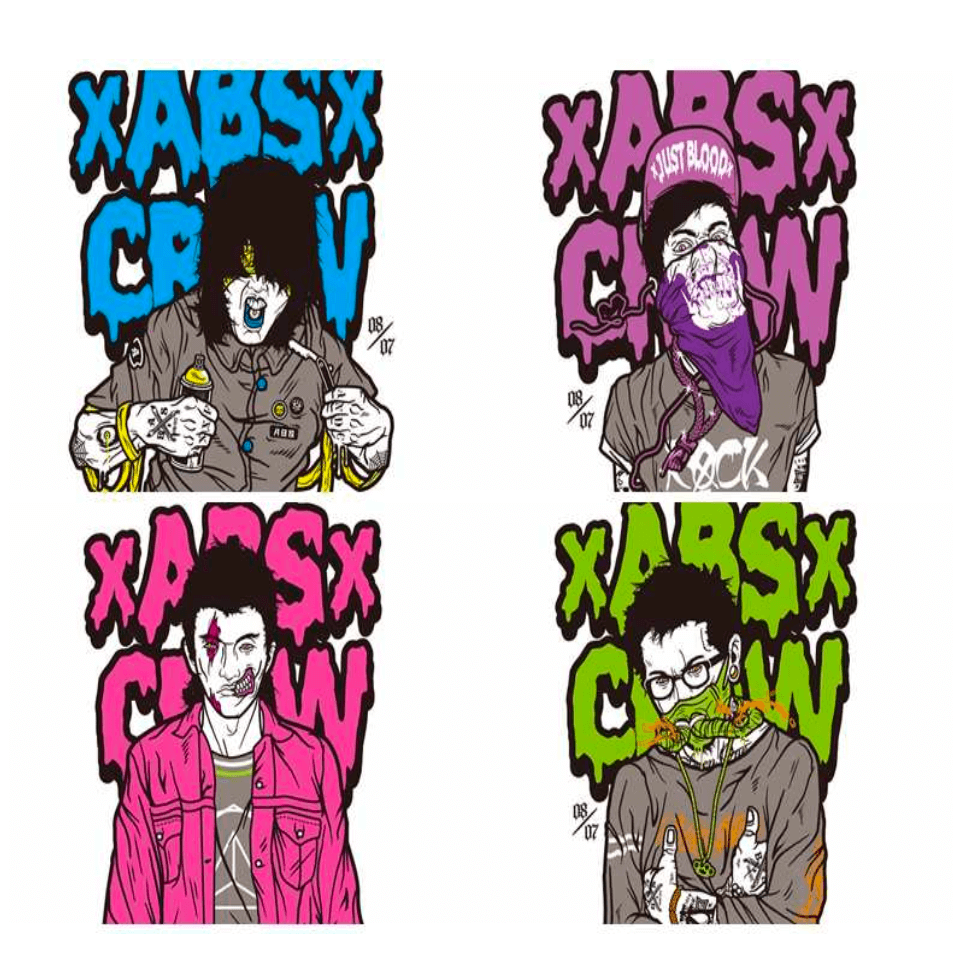
The name ABS is an acronym that has acquired several meanings over the years, the first of which is Around the Bohai Sea. The Bohai Sea is the innermost gulf of the Yellow Sea on the northeast coast of China, very close to the city of Beijing. It was chosen because the founders of the crew come from cities near the gulf, also known as Bohai Bay: Andc from Beijing, Seven from Tianjin, Noise from Dalian in the Liaoning province, and Scar from Shijiazhuang, the capital of the Hebei province (Wu 2014, p. 1).
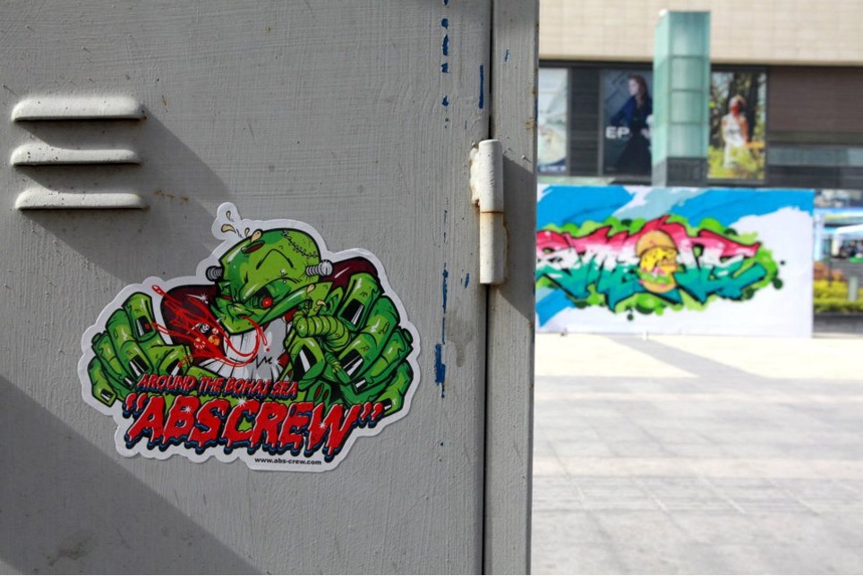
The second meaning is Active, Brilliant, Significant (Fitch 2012), referring to the qualities the crew seeks for their works. A Brand New Start is the third meaning, and the group’s greatest wish: a new mode for graffiti art to be created in China that represents the union of American and Chinese culture (2015 interview with Andc). The fourth and final meaning is Anti-lock Braking System (Valjakka 2016, p. 369) or Anti-skid Brake System (Wu 2014, p. 1) which implies the intent to follow the original idea of graffiti and standing firm on that path.
In 2010, the members of the crew moved to Beijing and established their studio in the 798 Art District. In 2012, they opened China’s first graffiti store, called 400ML, where they sold imported spray paint cans, books, graffiti-related items and their own original products, but most importantly, they created a hub for the promotion and spread of Chinese graffiti culture. The name of the shop was chosen because the standard capacity of the spray cans used for graffiti is 400 ml, but also because it stands as an acronym for “4” young Chinese people (the founders of the crew) who wish to be called Mr. Letter – “ML” – and dedicate “100” per cent of their time and skills to the art of graffiti (ibid.). The crew decided to open this commercial space after a trip to Europe during which they first had the opportunity to use European paints and realised the poor quality of the Chinese spray cans which, according to them, “smelled like industrial paint and had a much smaller variety of colours” (ivi, p. 3). Thus, they decided to start selling European cans in China in order to offer better quality products for the creation of successful graffiti.
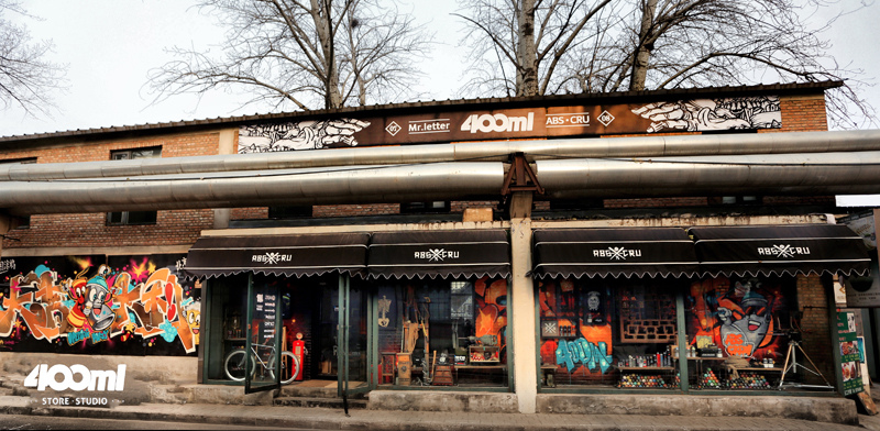
This trip to Europe, forming part of the 2011-12 EU-China Hip-Hop Communication Project, an exchange project between China and Europe dedicated to urban culture, marked a breakthrough for the crew. They were able to participate after winning the 2011 Wall Lords Asia Graffiti Battle, Asia’s greatest graffiti competition, held in Taiwan and attended by the main crews from the major Asian countries (Philippines, Singapore, Japan, Korea, People’s Republic of China, Indonesia, Malaysia, Thailand and Taiwan). Here, the crew was noticed by a German judge who invited them to participate in the exchange project (ivi, p. 2). Andc describes the overseas experience as follows: “In 2012, we travelled to Germany and Holland. We left by car from Berlin and drove through ten cities, finally arriving in the Netherlands. During the trip, we engaged in a rich intercultural exchange, sharing experiences and making pieces together with other local artists” (interview, 2016).
In thirty days, the ABS travelled from Berlin to Rotterdam and painted countless walls in the ten cities they crossed, together with other European writers, learning the German writing style and techniques. This was the turning point for the art of the ABS crew, who had originally worked with Chinese characters following the US styles. From this point on, they firmly changed course, abandoning charactering in favour of lettering, and searching for their own personal writing style, which became increasingly internationalised without every entirely losing sight of their Chinese origins. “In the beginning, we just imitated overseas styles. But after taking part in the international exchanges, we started to develop our own styles and incorporate Chinese elements – like calligraphy and the national flag – into our graffiti” explains Andc (Yau 2018).
For him, whose real name is Chen Chuang and whose tag58Tag (qianming tuya 签 名 涂 鸦) – The pseudonym, stage name, or code name that every graffiti artist, mc and breaker uses to distinguish themselves, to stand out and highlight their presence in the city. Being the most basic form of graffiti, created with spray cans or markers, the tag is the backbone of the writing phenomenon. The evolution of the tag represents the personal style of its author. All pieces, even the largest, most colourful and elaborate ones, remain, in essence, signatures. The activity of marking a surface with a tag is called tagging-up, while tag bombing is the reproduction of one’s tag on a large scale in a certain area of the city. Tags can also be representative of entire groups. Different writers or mcs who join together can decide to use one comprehensive tag, as a symbol of the group (see Crew). derives from the expression “And-Chen”, his approach to the world of graffiti derived from American writing. As he himself recounts, his first encounter with graffiti came through two documentary films on hip-hop culture: Wild Style (1983), which tells the story of New York’s street culture in the early 1980s, and Style Wars (1983), about a young graffiti artist from New York who used to paint underground cars in those years. From then on, Andc started painting graffiti together with a few friends, earning money from it and thus deciding to continue this rather fulfilling activity. From merely imitating American writing, Andc evolved to creating works in Chinese characters through which he could express its distinctive style. Examples of these early attempts are Zhanzheng wuqing 战争无情 (The Ruthlessness of War) and Tuo qi xiwang 托起希 望 (Raising Hope, Fig. 9) of 2009, produced in memory of tragic events in recent Chinese history, respectively the Nanjing Massacre of 1937 (a series of atrocities perpetrated by the Japanese army against the Chinese civilian population at the beginning of the Second Sino-Japanese War) and the Sichuan earthquake of 12 May 2008, which claimed approximately seventy thousand victims59The Beijing Penzi and the Oops crew also created pieces inspired by this tragic event.. The two pieces are wildstyle renderings of the four characters of the title inspired by a chengyu, a common pattern with other crews (e.g. the Kwanyin Clan). The writing style is very edgy and basic, consisting of one or two fill-in colours spread evenly, a single outline, and only occasionally a hint of 3D. The result is somewhat “rigid” and reveals the embryonic state of his personal stylistic research, centred on the attempt to reshape Chinese writing by imitating American styles.
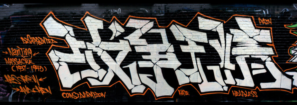
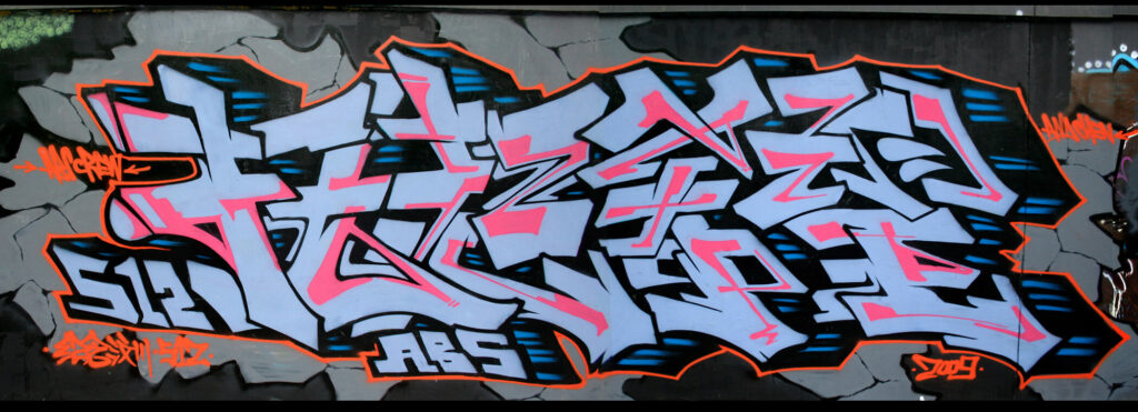
In search of a personal international style
After this first phase, however, the crew almost completely abandoned charactering in favour of the Latin alphabet and English language. Andc says:
I don’t need to use Chinese characters to show where I come from; I use the English alphabet, because that is where graffiti writing was born. Graffiti knows no national boundaries. What I do know is that it conveys strength and vital energy to me, therefore I do not slavishly use Chinese writing in my style, because that is not what I am interested in. Instead, I focus on increasingly improving my style, so that it can be representative of the country and the place where I come from, and eventually become a distinctive style of that place. (Interview, 2015)
This gave rise to works of a completely opposite nature to the earlier ones, but in which the western influence continued to be very present and almost “oppressive”. One example is Poseidon (Pic. 13) created by the ABS crew in 2011 during the China Wall Lords Graffiti Battle in Chengdu, in which nothing seems to lead back to their Chinese origins. This is how Andc recounts the crew’s participation in the competition:
In 2011 and 2012, we participated in the Wall Lords Graffiti Battles and won both the Chinese and Asian competitions. In 2011, the theme of the Chinese graffiti battle was classicism. We therefore chose to portray Poseidon, to recall the peculiar traits of ancient Greek mythology. (Interview, 2016)
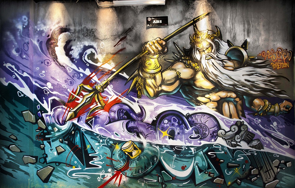
In this work, the central character of the graffiti is the Greek god of the sea, Poseidon, portrayed according to classical iconography: a muscular man with a beard, long white hair, armed with a powerful trident that he uses to rule over the sea. Other references to ancient Greek culture are the Ionic capitals (lower-right corner) and the hourglass (lower centre of the inscription), which in Greece was usually filled with water and used to measure time. The inscription is the most interesting and unusual part of the piece, because it offers different readings. The central part clearly shows SOP, which becomes POS: Poseidon if read backwards, from right to left, according to traditional Chinese practice. The divinity’s pitchfork, however, seems to point at another letter, a swirling A, followed by a B linked to the letter S. The letter P, the final letter of the inscription SOP, seems to hide a darker, barely visible part in the background – it could be read as an R which, combined with the other letters, composes the inscription ABS CR: ABS crew.
We are facing two opposite poles: on the one hand, charactering works in a Euro-American style (Fig. 9); on the other, lettering pieces with western visual references (Pic. 13).
Later, mainly due to their participation in the 2011-12 EU-China Hip-Hop Communication Project, the crew shifted to mostly lettering works, possibly featuring elements that plainly recall the group’s “Chineseness”, like dragons, pandas, pagodas and small calligraphic inscriptions, and certainly seeking a manifest stylistic recognisability. One of the earliest examples of such works is a graffiti created in Berlin by Andc, Redy from Hong Kong, and the German Mo (Fig. 10), during the 2012 project.
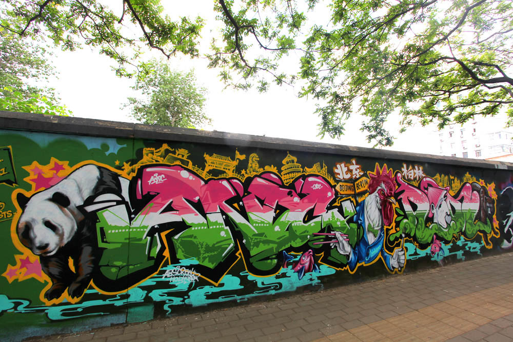
It is composed of the two tags, “ANDC” on the left and “REDY” on the right, in soft 3D style with a three-colour-band fill-in (pink, white and green) in different sizes, featuring glow effects and a big rooster in the middle. In addition to this unique general layout, there are several elements of “Chineseness”, especially on the left-side of the piece made by Andc: the panda, the Beijing skyline with the Great Wall, the Temple of Heaven, the lion figures typically protecting the imperial entrances, and the chopsticks held by the rooster in tailcoat. Chinese writings are also used as a corollary to the work in the colophon on the left and for the names of the Chinese and German capitals in the upper part of the work, Beijing 北京 (Beijing) on the left and Bolin 柏林 (Berlin) on the right. The contrast between the two cities is the very theme of the graffiti: the Beijing skyline is counterbalanced by that of Berlin; on one side is the panda, symbolising China, while on the other is the bear, symbolising Berlin; in the centre, the rooster holds chopsticks in its left wing and a fork in its right, while the sign above indicates Beijing on the left and Berlin on the right. This graffiti clearly shows Andc’s personal and recognisable tag style, which strongly differs from Redy’s and employs figurative, decorative and writing elements that highlight his origins. This is an example of the constant alternation, in the ABS crew’s works, between the desire for internationalisation, also evident in the composition of the team of writers who created the piece, and the desire to emphasise their “Chineseness”.
This piece gave rise to other works, like the one made in 2018 by the entire crew together with numerous Chinese and foreign writers at the Berlin Mural Fest, one of the world’s most important international festivals (Pic. 14).
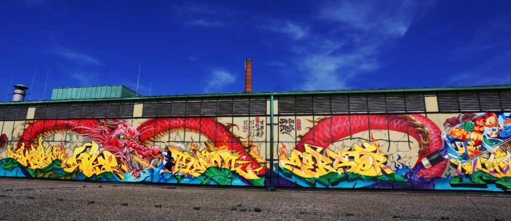
In this huge graffiti, the lettering part, with the tags of some of the artists in yellow in the lower section, is counterbalanced by a gigantic and fierce red Chinese dragon, represented according to classical iconography (crocodile head, catfish-like whiskers, mane and deer horns, sinuous snake-like body swirling in the background, chicken legs with sharp claws, and a flaming tail). This is depicted in the act of spitting fire on sea waves, over which float inscriptions that seem to emerge from the flames. The piece is scattered with calligraphic inscriptions in characters, alongside reproductions of Chinese seals with the names of the various authors of the work in Latin letters or characters. From the inscription Po fanlong 破樊笼 (The birdcage has disintegrated) emerges a majestic dragon, “haunting” the walls with its writings. Next to it the English phrase Joy in bottle recalls the name of one of the writers of the piece (Joybo), while on the right a bottle spills water that floods the bottom of the piece.
Compared to the previous graffiti, here the crew widely refined their technique, although the mode of action remains unchanged, if more complex. In fact, in both graffiti there are various juxtaposed wildstyle tags, distinct elements of Chineseness (bear, Beijing skyline, chopsticks, dragon, calligraphy, seals), Chinese writing and/or inscriptions (from simple names of capital cities to actual inscriptions), and various puppets60Puppet (tu’an 图 案) – Figurative elements alongside the graffiti. These may be human figures, animal-like monsters, or comic or cartoon characters (see Character). that animate the piece (rooster, bear, panda, dragon and a bottle full of other puppets). In addition, both graffiti are the result of international collaborations (the number of writers increased from three to about ten) and were created in Berlin (the first during the exchange project, the second for an invitation to a festival).
From 2012 onwards, plainly “Chinese” graffiti alternate with pieces in which “Chineseness” remains completely opaque, if not invisible, and which seem to aim for a very personal and recognisable style that clearly defines the identity of the ABS crew, regardless of its origin. Examples include the two graffiti pieces created for the Wall Lords Graffiti Battles in 201261See links in the Video section: Wall Lords China Stage 2012, video, 1’39’’, published on Vimeo by Wall Lords in 2014: https://vimeo.com/69828073; Wall Lords Finals 2012, video, 2’58’’, published on Vimeo by Wall Lords in 2014: https://vimeo.com/69828076; Wall Lords Final 2012 Official Video, video, 4’05’’, published on Vimeo by Adam Shu Ting Chen in 2013: https://vimeo.com/55290039., both the national (Pic. 15) and the Asian one, shortly after participating in the exchange project with Europe. As evidenced by these pieces, since then the art of the ABS crew has focused particularly on large-format and artistically elaborate works, mainly in wildstyle, with strong funky hints and comic-cartoon style references (Valjakka 2016, p. 362).
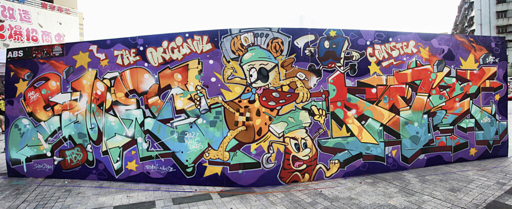
The layout of their pieces has also become more and more defined and consolidated: in most cases the pieces consist of large alphabetical inscriptions on kaleidoscopic backgrounds, mainly featuring the tags of some of the crew members (Wu 2014) and animated by amusing puppets placed in the centre of the composition. The piece The Original Canster (2012, Pic. 15) is one of the earliest examples and created a template for later ones. With this piece, the ABS crew won the 2012 China Wall Lords Graffiti Battle in Shenzhen, a city close to Hong Kong in the Guangdong province. The piece consists of two large tags of two crew members (SMER on the left and ANDC on the right) on a multicoloured background. The two wildstyle tags are painted with bright, highly shaded colours (orange, yellow, green and blue) rich in glow effects, bubbles and inlays, surrounded by glittering stars and flaming meteorites. At the centre, between the two tags, are three cartoonish puppets: two anthropomorphised spray cans dressed like the Flintstones, chased by a square-shaped policeman with a moustache. The bigger spray can is the protagonist; its appearance is a mixture of a pirate (wearing a one-eyed patch), a thief (carrying loot on its shoulder), a caveman (holding a club and wearing leopard skins) and a hip-hop writer (holding a spray can in one foot and listening to music from a ghetto blaster, an audio-cassette recorder with a built-in speaker, popular in the New York ghettos of the 1980s). This is the “original canister” mentioned in the title, the alter ego of a primordial writer who storms the streets like a pirate and is chased by the police like a thief. Since graffiti in China is not fully illegal, as we previously mentioned, the work is probably intended as a tribute to the original forms of graffiti, when writers were seen as street thugs and chased by the police for their activity, which is still considered illegal in the rest of the world. The canister is thus original in both senses: it represents the earliest form of graffiti art from the early days in the United States, and, at the same time, it embodies a brand-new form of graffiti. The title also plays with words: the word canister (container, jar, can) becomes canster, a term that does not exist in English and apparently seems a mistake, but was purposely chosen by the crew because it contains the word can, used in graffiti jargon.
This graffiti lacks references to China. Everything seems to belong to the western universe: the Latin alphabet used to write the two large tags; the English title and the numerous small inscriptions disseminated in the piece; the puppets that recall figures belonging to western culture, like the Flintstones, pirates and graffiti writers chased by the police; the wildstyle and the cartoon-like style, which belong to the Euro-American style category, although rendered here with personal flair.
As mentioned above, the layout of the piece divided into two large letterings (usually SMER and ANDC) with puppets in the middle to break their continuity; the multicoloured and glittering background; the use of the Latin alphabet and English language; images with strong western references (e.g., cowboys, zombies, Christmas decorations, Halloween characters and Greek mythology); wildstyle lettering and a cartoonish style for the figures, are all leitmotifs of the ABS crew’s murals. The same approach can be found, for example, in the work Rock da Party. It was created by the crew in 2012 and won the second place at the Asia Wall Lords Graffiti Battle in Taipei62See: Wall Lords Final 2012 Official Video, video, 4’05’’, published on Vimeo by Adam Shu Ting Chen in 2013: https://vimeo.com/55290039; Wall Lords Finals 2012, video, 2’58’’, published on Vimeo by Wall Lords in 2014: https://vimeo.com/69828076., which the ABS crew entered after winning the national competition with The Original Canster. The theme is more festive: balloons, streamers, lights, stars and sugary cream scattered all around act as a frame for a festive moustachioed spray can followed by a candle who is in love with her loot; together, these two animate the two large signatures at their sides.
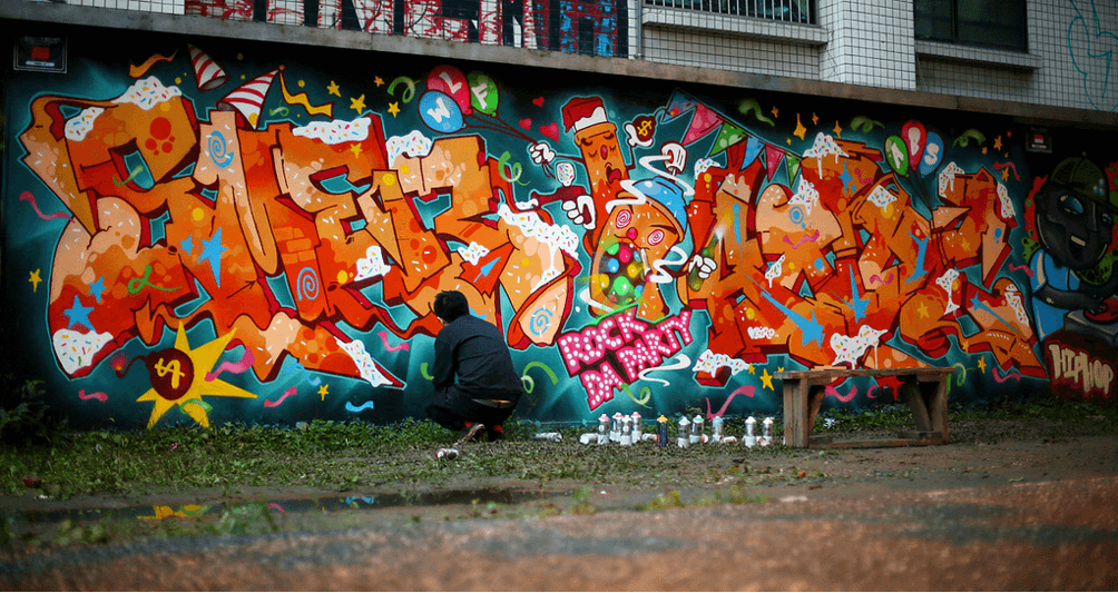
While in these pieces any “Chineseness” is completely eluded, in other – rarer – charactering pieces it is overtly evident. While these use Chinese characters for the central writing, in the same manner as the 2009 works, the charactering style is completely different and tends to resemble that of the two pieces analysed above. One such example is the graffiti created for the opening ceremony of the 400ML graffiti store in 2012, which still occupies one of the exterior walls of the shop with the four Chinese characters Dajidali 大吉大利 (Good Luck and Great Prosperity, Fig. 11).
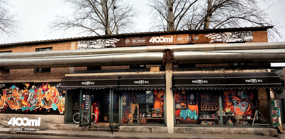
This graffiti in Chinese characters is much more complex than the previous ones. The charactering is more eye-catching and dynamic, the wildstyle has been abandoned (although some arrows still recall it) in favour of a 3D style with easily recognisable characters; the fill-in colours are highly shaded and range from red to brown, distancing themselves from the original monochrome or two-tone. The piece is also enriched by several cartoonish puppets: a spray can and a firecracker in the centre, and a beer mug holding a spray can on the right. The background is filled with multicoloured bubbles, sparks and bursting firecrackers. The writing Opening Party in the centre and the colophon on the right listing the participants in the party are in English, while the central writing, the name of the location of the event (Beijing 北京, top right) and the theme of the party (Zhongguo tuya 中国涂鸦, lit. Chinese graffiti, top left) are in Chinese. Thus, there is clearly a gulf between the charactering graffiti of 2009 and 2012: the latter reveals meticulous research and a considerable evolution of style, and can be compared with works like Rock da Party and The Original Canster. In a 2012 interview, Andc reiterated: “I have been making graffiti for eight years. In the beginning I wrote wildstyle pieces in Chinese characters. Now my pieces have turned into expressions of my daily life. My style is constantly evolving and challenging me to reach new limits” (see section Video, ABS crew 2012, 2012).
A mode of expression akin to that of Dajidali was also used in 2013 for the street graffiti Beijing Air Toxicity 北京有毒 (2013), an exposé against heavy pollution in Beijing, where the four bubble-like characters, Beijing you du 北京有毒 (Beijing is polluted), alternate with the English words of the title. Another example is the 2018 Naigao 耐高 advertisement for Nike, in which the Chinese name for Nike is written in bubble style on a colourful background. Although these creations also use Chinese characters, they are much closer in style to the two Wall Lords works of 2012 than to the more “Chinese” ones of 2009. This passage is well explained by Andc: “Many years ago I wrote some pieces in Chinese characters, then I travelled to many cities and countries, and developed the idea that graffiti are a way to express a personal style” (interview, 2015).
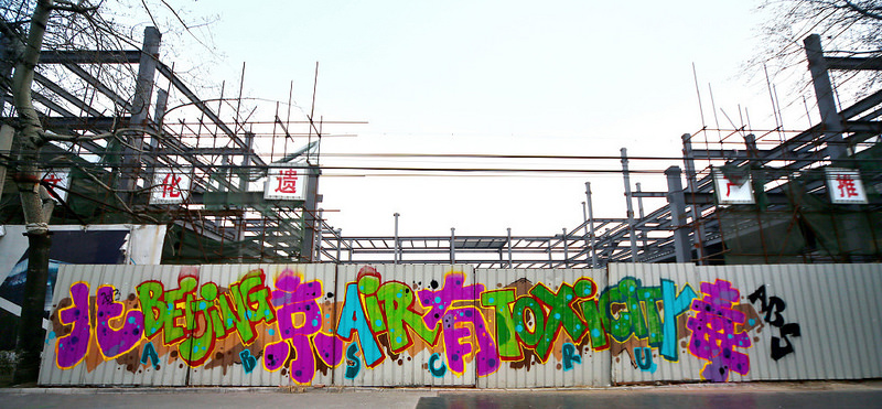
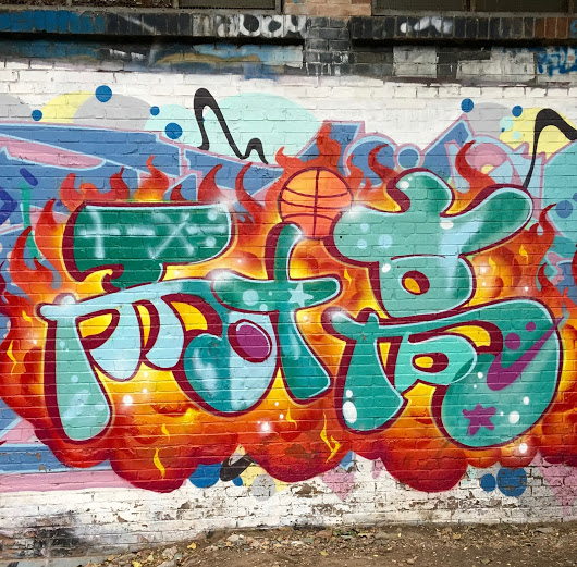
Therefore, in terms of writing, the ABS crew significantly prefers to use the Latin alphabet, while in terms of puppets and decorative elements, they combine references to Chinese and western characters, as well as to the hip-hop culture. Indeed, b-boys63B-boy – Short for break-boy, or break-dancer. Over time, the term has been used to designate those who join the hip-hop culture. The female counterpart is b-girl. (breakdancers), skateboarders, graffiti writers and guys wearing hip-hop clothes are recurring figures. References to “Chineseness” are more frequent in foreign works, while those in characters are only created on Chinese soil (since they would be incomprehensible outside).
Despite all these distinctions, the style of the crew has gradually been shaped and defined since 2012, becoming more recognisable, regardless of the type of writing and puppets used. It is a very “international” style, easy to read and appreciate even abroad. This desire for “internationalisation” is visible not only in the crew’s style but also in the way they operate. Since their participation in the 2011-12 EU-China Hip-Hop Communication Project, the crew has engaged in frequent collaborations with foreign writers in China and abroad. In Beijing they worked with the Italian Sbam and the German Zyko. They have also participated in worldwide graffiti art festivals (especially in Europe and the United States, like the Berlin Mural Fest in 2018), and organised international graffiti-related events, including Graffiti On and Meeting Neighbourhood, an annual non- commercial event organised in Beijing in collaboration with the local government, which attracts graffiti writers from all over the world and aims to introduce graffiti to a wider audience. Their blog pages are filled with photos of trips to the United States and Europe (Crayon 2017), especially those of Andc, who visited Germany twice in 2018 (Yau 2018). This tells us a lot about the crew’s desire for “internationality”, while always remaining faithful to their culture of origin.
Brand, public art and social commitment
The internationalisation of graffiti carried out by the crew goes hand in hand with its commercial breakthrough. It can be affirmed that “the ABS crew led the way veering towards the commercial side of graffiti” (Bonniger 2018, p. 24), and it is no coincidence that they have a business development director, Wendy (Valjakka 2016, p. 369), who takes care of the growth of their brand and relations with potential clients. The commercial success of the crew is not only linked to the 400ML shop, but also to numerous collaborations with famous brands, like Red Bull, Adidas, Puma, Nike, Audi, Volkswagen, TAGHeuer and Ispo, for which they create works on commission.
However, the crew strongly emphasises that these collaborations do not affect their creative activity in any way and should therefore not be seen in a negative light. Andc explains:
Collaborations with foreign brands increased our ability to influence the general public, which is a very positive thing for us, as it gives more and more people the opportunity to discover and understand graffiti. This is just business and does not affect the creative part of our work at all; on the contrary, it serves to finance our activity and inspire us with new ideas. The money we earn is reinvested on the street to create illegal graffiti. Furthermore, it allows us to sponsor and organise graffiti-related events such as, for example, the annual Neighbourhood Meeting, which gathers plenty of graffiti and hip-hop culture enthusiasts with no commercial aims. (Interview, 2015)
As Andc explains, in China “[…] there are no solid economic foundations to support graffiti. Many young people do not have the opportunity to engage in this kind of activity because they have to look for jobs so as to make ends meet. I have met many talented graffiti writers who eventually had to stop making graffiti as it did not allow them to earn a living” (interview, 2016). Thus, finding a way to earn money through creative activity is a blessing. In fact, it is no coincidence that the ABS is the longest-running crew in Beijing, as its members have managed to turn graffiti into a job. Even though this may be controversial, one should understand the peculiarities of the Chinese environment, where young people are subjected to heavy family pressures, society is extremely competitive, and most people do not even know what graffiti is.
The crew is uncompromising about respecting their creative freedom in these collaborations. Although these works advertise brands or products and writers have to adhere to the theme of the piece, they must feel free to paint and represent whatever they want, choosing their desired style.
We have never asked for help from commercial brands on our own initiative, but they contact us because they hope that, through the creative freedom they give us, the quality of the pieces will be even higher. If clients tried to limit our artistic freedom, we would immediately stop the collaboration. This is not about works that we make illegally, but about brands that give us the opportunity to create pieces that are still our own, and I think that this is not at all bad – says Andc. (Interview, 2016)
Among the countless works commissioned by famous brands, some are particularly successful because the goal of the crew to preserve their creative freedom and create something original and clearly recognisable was perfectly achieved. One example is the work commissioned by Red Bull in 201264See: ABS crew x Red Bull, video, 2’53’’, published on ZCool by ABS_Noise in 2012: https://www.zcool.com.cn/work/ZMTE1NDc2NA==.html; Red Bull Nanshan Open / Nanshan Ski Resort / Beijing / PR China, video, 3’34’’, published on Vimeo by Steve Zdarsky in 2013: https://vimeo.com/48152930. (Pic. 16) to celebrate the 10th anniversary of the Red Bull Nanshan Open, the most important international snowboarding competition held in Asia, which took place at the Nanshan Ski Village in Beijing.
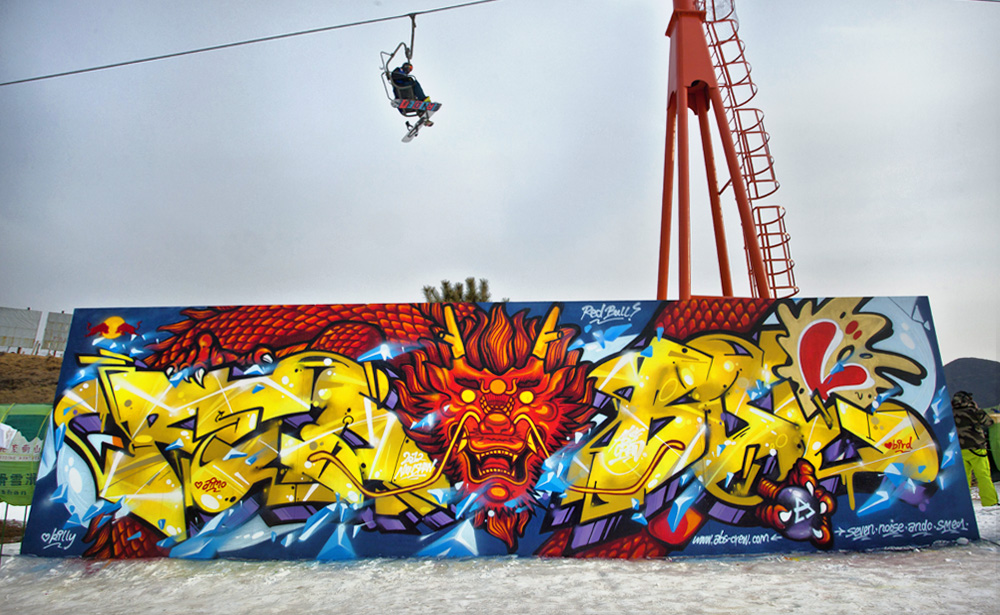
The piece consists of the yellow Red Bull inscription, created through elaborate wildstyle with 3D rendering. At the centre stands the face of a red dragon, depicted according to the typical Chinese iconography previously illustrated, and two chicken legs harpooning the inscription and a shiny pearl. Traditionally, Chinese dragons breed by fertilising a pearl that they usually hold in their jaws. In classical iconography, the pearl is sometimes flaming and is a symbol of wealth, prosperity and good fortune; the pearl here is not flaming but shiny, and contains the letter A, standing for ABS. We often find this kind of crew logo in their work. Although not flamboyant, the pearl is meaningful: two arrows on its sides respectively point at the official website of the crew and the names of the writers who created the piece: Seven, Noise, Andc, Smer.
By portraying a dragon the crew wanted to celebrate the upcoming beginning of the Year of the Dragon. The competition was in fact held between 14 and 15 January and the Year of the Dragon, which was about to start on 23 January. According to the traditional Chinese calendar, consisting of twelve-year cycles, each year is associated with a different animal – mouse, ox, tiger, rabbit, dragon, snake, horse, sheep, monkey, rooster, dog and pig. The Chinese New Year does not coincide with the Gregorian calendar, but falls on the first new moon after the Sun enters the sign of Aquarius (between 21 January and 19 February).
The famous slogan “Red Bull gives you wings” also certainly influenced the choice of the dragon as a puppet: the ABS crew decided to portray the creature that above all in their tradition flies with strength and vigour, with the intention of conveying the idea of power and robustness embodied by the dragon (and by the effects of Red Bull). In addition, the colours used in the graffiti – the yellow writing and the red dragon – are reminiscent of the colours of the Red Bull logo portrayed at the top left-hand corner of the work. The blue background evokes the idea of ice smashed by the might of the dragon, as well as the glacial and snowy landscape that frames the event; but is also a reference to the colour of the Red bull can. The horizontal progression of the writing and its rounded edges recall the shape of the snowboard, which formed the basis of the sketch65Sketch (shougao 手 稿) – The draft of the piece. Usually, every writer has a sketchbook in which they practice before painting on walls. for the piece, as shown by one of the writers in the video on the making of the work.
This is how Andc recounts this experience:
Red Bull has always supported our creative activity. The idea for the graffiti was ours, and Red Bull gave us a lot of creative freedom. […] In this case, Red Bull contacted us because they were looking for someone who had graffiti in their blood and would bring this out in their creative work. To us it sounded exciting to say the least, and therefore we accepted! […] The piece we made on that occasion was used as the backdrop of the stage at the awards ceremony. (Interviews, 2015, 2016)
Other occasions for the ABS crew to collaborate with major brands often fall in conjunction with ‘breaking battles’ – breakdance competitions mostly sponsored by the brands themselves – for which the group is asked to create works on panels that serve as backdrops to the competition. “I have a lot of b-boy friends who participate in breaking battles every year. I love the art of breaking so much, that’s why I frequently attend such contests, which are often also an opportunity to make graffiti” says Andc (interview, 2016). One such opportunity came a few years ago through Puma. Andc was called in by the brand to create the competition backdrop, for which he painted a colourful graffiti featuring a central piece of writing in wildstyle and 3D style that bore his tag along with two b-boy puppets in Puma sweatshirts on either side.
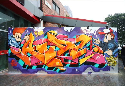
Collaborations with important brands relate not only to the creation of graffiti but also of graphic works. In 2015, for instance, ABS designed a calendar with images of their graffiti, in collaboration with TAG Heuer.
The crew can also rely on government support to obtain spaces where they can create graffiti legally and organise the annual art festival Meeting Neighbourhood in the 798 Art District. “[…] The government supports our work, helps us find the necessary spaces to organise graffiti-related activities, and orders the police to ensure security on the days of the events,” Andc affirms (interview, 2015).
The crew also collaborates with the government on specific projects: in 2014, for example, they painted ten city shuttle buses during the government-sponsored art festival in Beijing’s Central Business District (CBD). “We know the government leader for the festival and he’s very young, he’s not an old man, so we were talking with him about how to do fresher projects [and he agreed],” explains the writer (Bidisha 2014). This kind of collaboration may seem contradictory in the graffiti context, but again we have to make an effort to identify with the background in which the group operates.
Even though the crew has its own shop with branded products, collaborates with famous brands, can count on government support, and participates in public art commissions, they have never stopped making illegal graffiti on the streets of the city. On the contrary, as the ABS has repeatedly pointed out, all these jobs largely serve to finance activities on the fringes of legality and to get more liberty to “bomb” the streets of Beijing with their tags. Andc constantly mentions the ABS’s “obscure” work. This takes place “at night on the streets” (ibid.) and stems from the desire to cover the city with their tags, to “say something to people and make works that are comments on society” (ibid.). There are several tags, throw-ups, blockbusters or even more elaborate pieces created on abandoned or soon-to-be-demolished buildings. Some members of the crew even write on train cars, a real rarity in China where graffiti of this kind is not allowed and thus extremely dangerous.
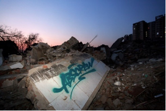
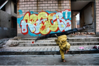
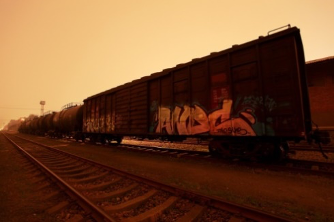
Of equal importance are their works serving as a social exposé. Among them, the most representative is undoubtedly Inflation (Tonghuo pengzhang 通 货 膨 胀 ) from 2012 (Pic. 17).

The graffiti was created as an act of protest against the rise in inflation and the cost of pork that occurred in Beijing that year (Valjakka 2015, p. 271), bringing a large part of its citizens, particularly the underprivileged, to their knees. The piece hinges on the central figure of a huge pig, with a cigar in its mouth, sliced by a large butcher’s knife. To his left and right respectively appear the multi-coloured elaborate wildstyle inscriptions SCAR and ANDC, surrounded by coins, cash, diamonds and gambling dice on a kaleidoscopic background. On either side, two vampire-like pigs with partially stripped flesh ferociously gaze at the large central puppet. This piece depicts the “animal” brutality of financial speculation and the economic careerism of modern society, where money happens to be the last (dis)value left, while the population is “sliced up” and “stripped of its flesh” like the puppets depicted. The graffiti was created along the Jingmi Road hall of fame. This is a particularly significant location for the crew because they were the first to paint it in 2010 and since then have been frequently making graffiti there, attracting more and more graffiti writers, making it the longest hall of fame66Hall of fame (tuya qiang 涂 鸦 墙) – A space where graffiti writing is (more or less) legal. Halls of fame are mainly popular with writers who aim to create artistic, sophisticated pieces, favouring quality over quantity and constantly searching for original styles. in the capital in 2012. They benefit from the fact that Jingmi Road is part of a district in the northeast of Beijing that does not fall under any jurisdiction, and therefore graffiti cannot be removed either by the “workers in charge of cleaning and sanitation of the environment” (huanweigong) nor by the “workers in charge of keeping the highways clean” (gongluyanghugong) (Llys 2015).
Another social battle pursued by the crew is against pollution in the capital, which has reached intolerable levels over the years, making the air truly unbreathable. Among the works that address this issue, Beijing Air Toxicity (2013), in characters and bubble letters on sheet metal, and Dirty City (2015) are certainly worth mentioning.
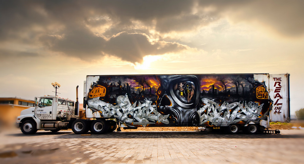
Dirty City was created on the door of a lorry and portrays two zombie-like men in the centre, forced to wear gas masks due to the toxicity of the surrounding air. The background is the ash-grey skyline of an industrialised city made up of menacing smoking chimneys, disrupted by two large wildstyle letterings in the foreground. This apocalyptic scenario foreshadows a not-so-distant future in which humankind will be deprived of one vital asset: the air we breathe.
In conclusion, it emerges that the ABS is an extremely multifaceted crew, and indeed the most versatile in Beijing. Its creative activity ranges from illegal street bombing to collaborations with famous commercial brands; from work on halls of fame granted by government authorities, to the creative assault of abandoned buildings on the outskirts of the city; from exposé pieces on skeletons of industrial archaeology, to design works for merchandising products. Their style is strongly influenced by the Euro-American tradition and steeped in hip-hop culture. It is characterised by strong wildstyle accents and funky notes, and mostly eschews the use of Chinese characters, although at times it presents references to their culture of origin, especially in the choice of puppets and decorative motifs. The crew is increasingly opening its style to the world, also thanks to its international vocation. However, its focus remains firmly on Chinese soil, and its ultimate aim is to promote and spread graffiti culture in China. According to Andc, the main intention for the future is to put “all possible energy into making graffiti an increasingly popular art form and to involve more and more young people in this activity” (interview, 2015).


